FORUMS - COASTERFORCE
You are using an out of date browser. It may not display this or other websites correctly.
You should upgrade or use an alternative browser.
You should upgrade or use an alternative browser.
Flamingo Land | Sik | Intamin 10 Inversion Coaster | 2022
- Thread starter Pierre
- Start date
Peet
Giga Poster
They've been painting it for 6 weeks now so the progress not *that* good!Painting continues and it looks like they are making good progress.
otwidalepda
Roller Poster
Wonder what the theme is going to be.... cannot think how a brown building, black silver track and black fencing to together...
Nicky Borrill
Strata Poster
I can confirm that FL have entered into the CF Speed Build contest, and as such must keep theming to a minimum and make good use of landscaping instead...I'm hoping they'll do what the average planco player does and just smother it in foliage.
Edit: Great, now I want to play some Planco. I'm at work.
Nicky Borrill
Strata Poster
I quite like it to be honest.
One question though, the grey supports, why are some black and some grey. Surely the grey isn't just an undercoat, they wouldn't bother with undercoating before black.
One question though, the grey supports, why are some black and some grey. Surely the grey isn't just an undercoat, they wouldn't bother with undercoating before black.
Nicky Borrill
Strata Poster
It's definitely possible, and was my initial thought, but you can see supports from the same angle that seem to be different shades. Still plausible though, maybe those darker ones are in a shaded area and the others aren't.I'm not convinced that it isn't simply the way that the color looks at certain angles in the sun.
Those low supports after the rolls definitely look the same colour as the fence, anybody know what colour the fence is?
Nicky Borrill
Strata Poster
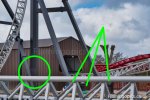
This picture highlights the reasons behind my thinking... The lines point to what seem to be very different shades, despite being in a similar area. The circle highlights what seems to be an additional coat being applied (Could be wet paint, but that's a good old sized portion of wet paint, so it must be slow drying if so)


I never expected there to be themeing for this coaster to be fair. I'm sure with a grey colour scheme and a name like Inversion, it wouldn't be hard to fit into the 'Metropolis area' where themeing is minimal anyway. Hero has an entrance sign, and wooden hut/station clad in steel factory flooring. Velocity has a weird shaped roof on the station. Yes Flamingo one fits this area, but it's hardly groundbreaking. For flamingoland on a whole, we get a nice station and queue entry sign.....that's it, not exactly themed......this new coaster doesn't have either!!!
In my opinion, the park has the usual light themes of an amusement park, similar to Six Flags, or cedar fair, the park is hardly a theme park! Although the zoo and pirate show stand out as themed additions!!
In my opinion, the park has the usual light themes of an amusement park, similar to Six Flags, or cedar fair, the park is hardly a theme park! Although the zoo and pirate show stand out as themed additions!!
Fleetwood_Mack
Mega Poster
I think grey with yellow supports actually makes a nice contrast next to Velocity. That's a shame!Painting continues and it looks like they are making good progress.
View attachment 16540
Source: https://m.facebook.com/TPIOfficial/?refid=13&__tn__=,g
otwidalepda
Roller Poster
But where else will all of the budget go . . .I never expected there to be themeing for this coaster to be fair. I'm sure with a grey colour scheme and a name like Inversion, it wouldn't be hard to fit into the 'Metropolis area' where themeing is minimal anyway. Hero has an entrance sign, and wooden hut/station clad in steel factory flooring. Velocity has a weird shaped roof on the station. Yes Flamingo one fits this area, but it's hardly groundbreaking. For flamingoland on a whole, we get a nice station and queue entry sign.....that's it, not exactly themed......this new coaster doesn't have either!!!
In my opinion, the park has the usual light themes of an amusement park, similar to Six Flags, or cedar fair, the park is hardly a theme park! Although the zoo and pirate show stand out as themed additions!!
Peet
Giga Poster

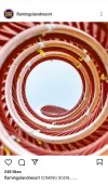
Official Flamingo Land Resort on Instagram: "COMING SOON........ An Amazing photo taken by @thrillriders thank you for sharing this with us 📸 #flamingoland #comingsoon"
628 likes, 30 comments - flamingolandresort on March 25, 2022: "COMING SOON........ An Amazing photo taken by @thrillriders thank you for sharing this with us 📸 #flamingoland #comingsoon".
 www.instagram.com

"Coming Soon"
Not exactly Big News, but it is the first time since Feb 2020 that Mingo have mentioned this on their social media at all.
Interesting that they shared a pre-paint job pic!
