CrashCoaster
CF Legend
I think it is still a bit magical. I think the old logo did need updating though...
I think it is still a bit magical. I think the old logo did need updating though...


")
The logo of Phantasialand looks magical to me.

Opinion from someone who's never been (so has no nostalgia): I like it. It fits in with the fact that fenix looks like a big step up in investment for them (not that Troy doesn't look good) and is like "we take this themed magical stuff seriously now" compared to their playful old logo. Again, never actually been there so no idea what the park looks like inside with theming etc.
I must entirely disagree with you. The phantasialand logo is not subtle. First time I saw it was before I knew how was the inside of the park, and it actually made me worry that the park was going to force feed me with saturated fantasy and tacky magic.But I would guess that your fond memories and nostalgia play a part in that, because you associate that logo with magical experiences. Semiotics etc etc. Perhaps if you had never visited Phantasialand, you wouldn't immediately get that from the logo.
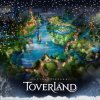
Yeah, I’m really loving the new logo as well. I’m really excited about visiting Toverland this season for the first time.
Sent from my iPhone using Tapatalk
All the park are saying is Summer 2018.Anyone got a rough idea of when the new entrance will be ready and when the new area might open?