What's new

Scw55's Thread. Planet Coaster Calls (18-11-17)

Re: Scw55's Thread. Cryo (4/2/14)

To be honest, concerning the X-train, I'm not too certain. No Maurer creations have as of yet featured X-trains, but the latest coaster at Romon World, China is rumoured to be using them is order to have an ameliorated throughput. Therefore they might be capable of inverting like the X-car designs before them.

I've always believed, due to their reminiscence to B&M hyper trains, they were more suited and designed specifically as competition to other hypers/megas.

Anyway, a 'hyper' or a 'mega' isn't necessarily a model; it's more commonly used as a classification of height (200ft+). Your coaster (apart from the height) seemed to be typical of the hyper layouts opposed to a looper...there aren't many notable coasters with just 1/2 inversions, that's why.

But it's rct3 at the end of the day - I prefer realism but do what you want! :--D
 
Re: Scw55's Thread. Cryo (4/2/14)

It was to satisfy a contest condition of having only one inversion.

Think of it as over banking.
 
Re: Scw55's Thread. Celeritas (8/3/14)

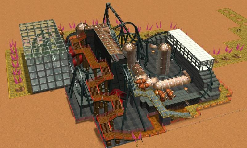
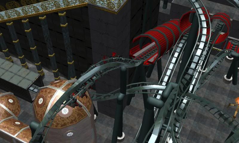
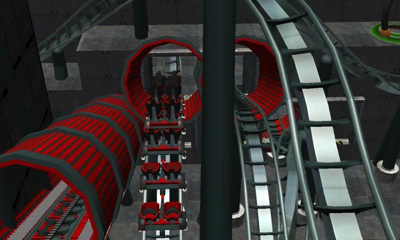
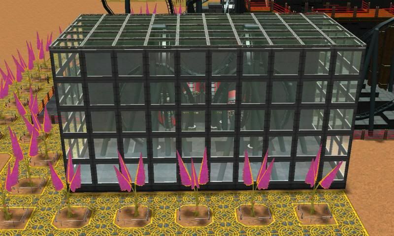
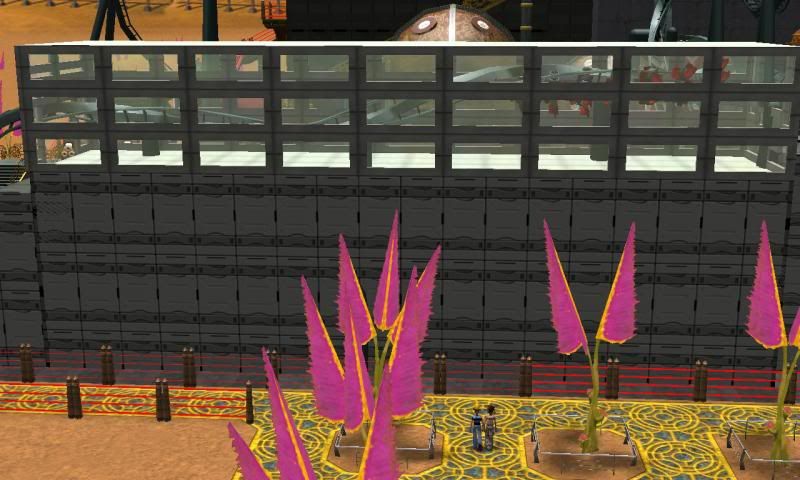
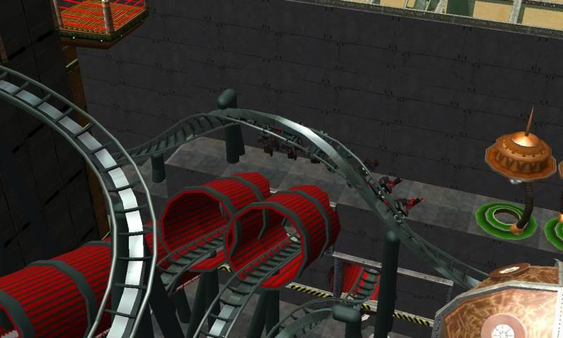
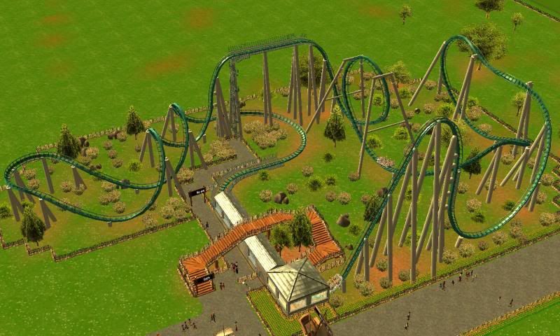
Here's Celeritas. It's a 16 inverting monstrosity. I had fun with CS. I'm happy how it's came out.
I used pieces of default Sci-Fi scenery to soften the amount of grey and black.
However building such a compact layout means constructing buildings are really fiddly.

(Yes this is another contest coaster over on TowerTimes)

2014-03-08_00006_zps9445e1f4.jpg

2014-03-08_00002_zpsffc61aac.jpg

2014-03-08_00003_zps231a0edb.jpg

2014-03-08_00001_zpsf6318886.jpg

2014-03-08_00004_zpsf2bbf229.jpg

2014-03-08_00005_zpsb153da96.jpg


[youtube]http://www.youtube.com/watch?v=dilW9JH3xH0[/youtube]

For a many-inverting coaster, I don't think there's too many filler inversions. Only one in my opinion.
 
Re: Scw55's Thread. Name this Octopus (18/4/14)

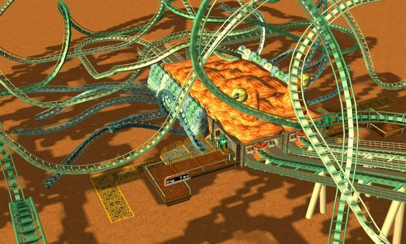
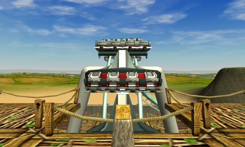
I'm in the middle of building a Duelling Wingrider. Well, the layout is complete, I just need to support the thing and theme it.

Here's a screenshot of the station:
2014-04-12_00001_zps69c50cd8.jpg


The theme is that the coaster is a sentient creature (looks octopody).

However I have one problem. I lack a name. And without a name I have no idea how I will go about theming the ride.
The ride sits in a Sci-Fi Theme Park that already has two coasters that uses Spaceworks. I don't have confidence in my ability to create a third *unique* feeling environment with that set. I don't want the park to be "Steeland" or "Ironland". So if you guys could suggest a name that might fit a duelling Wingrider themed around being a creature, it would help me decide how to theme the area.

Suggestions to how I could modify the station might be welcomed too. Because it doesn't feel complete.
 
Re: Scw55's Thread. Syth (4/5/14)

I have a new park (this is 3 on the cycle now. 4 if I take my desert out of retirement).

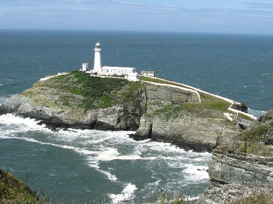
The Park is based off a photograph I saw in a Holiday Advert.
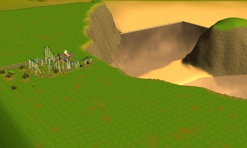
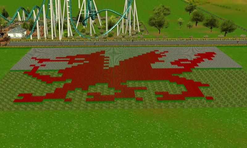
The theme is the Welsh Countryside (like the previous park). But this time, more coastal.

The park is called: North Stack

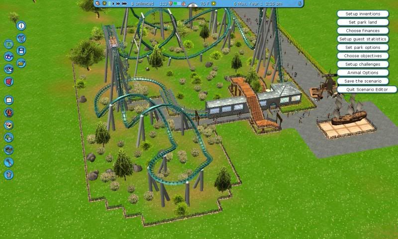
So, this is the first ride, a roller coaster (what a shock).

Syth (Welsh for Vertical. If you don't know that, it sounds like "scythe" which sounds bad arse)

[youtube]http://www.youtube.com/watch?v=sWyH66JKfqc[/youtube]
2014-05-04_00005_zps702b837b.jpg

2014-05-04_00003_zps17bd4c1e.jpg

2014-05-04_00004_zps36622a28.jpg

2014-05-04_00002_zpse179e389.jpg


(I forgot to add footers and I need to modify the block settings. Since it took me 2 hours to upload the POV video, it's unlikely I'll ever show it on a PoV)
 
Re: Scw55's Thread. Syth (4/5/14)

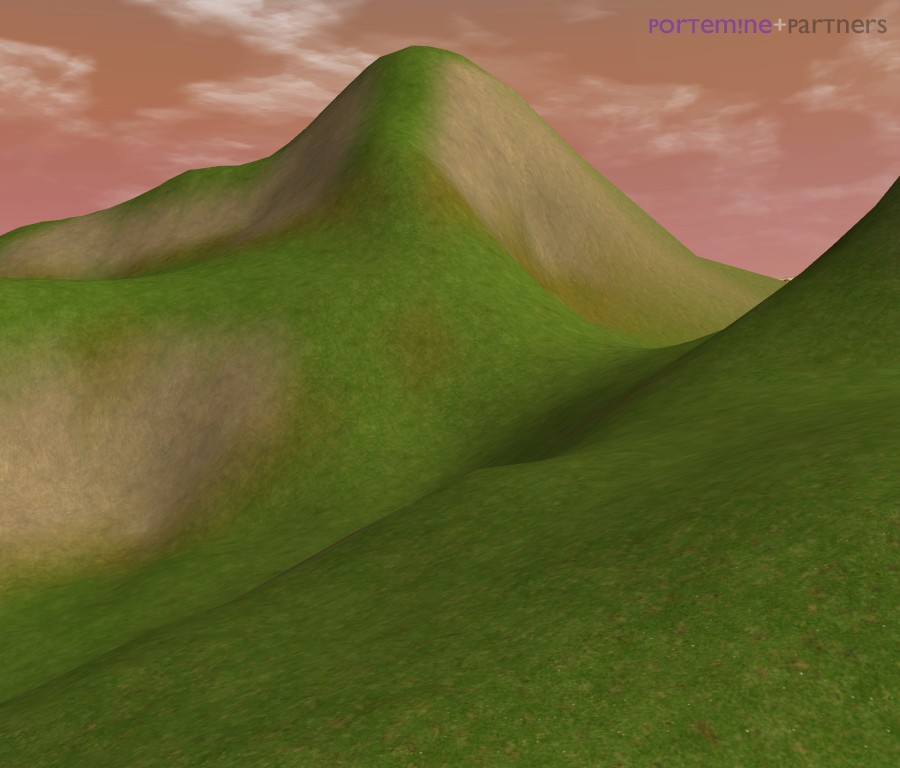
Hello Scw ! Glad you're still active in RCT3. I like Syth, its layout is simple yet convincing, well executed. Your terrapainting skills have improved too, the patches of sand/mud here and there really add to the landscape and make it less bland. For your cliffs, I would consider adding other textures such as light rock or even the snow rock texture. But on terraforming grounds, the cliff is pretty well made !

Hope to see more,
Porte
 
Re: Scw55's Thread. Teaser (11/05/14)

I agree with the cliff-face texture. It doesn't quite sit right with me. It's too... volcanic looking.
This is sort of what I want to achieve:
south-stack-light-house.jpg

I'm not sure I could achieve a consistently weathered appearance, but I will try lighter textures.
It looks like the tidal part of the cliffs are black though.

St_Tudno_Great_Orme.jpg

Puffin_Island_(Ynys_Seiriol),_Anglesey.JPG


If I want to replicate the terrain better, looks like I will need to spend a lot of time placing rocks. Perhaps I can do this in between building rides. I could even do some of this for the B&M Flier I am about to tease:

Oh here's a teaser of something I've been working on today:
2014-05-11_00001_zps33e9b510.jpg


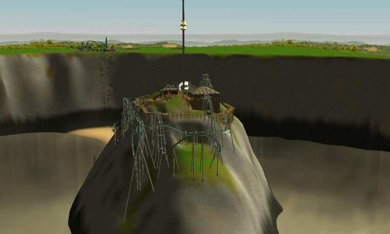
You can see it's a B&M Flier. It's in the same park, just it's on that solitary rock out at sea.

Layout and Supports are done. Station is complete/almost complete. It's just little bits that I need to add.
I need to work out what sort of foliage would suit the area.
And of course, experiment with textures for the cliff faces.
 
Re: Scw55's Thread. Teaser (11/05/14)

I see what you mean. I think Weber's Boulders and Brush CSO set provides the closest rock colour to what you look for. Link It may be too small for such a large cliff though.

Here's an experiment terraforming I've made a year ago. It's not really a cliff (rather some steep hills) but I guess it shows what light rock textures can look like :

secret13.jpg

rocks.jpg


If I remember correctly, the steep hill is made of bland light rock (7) + some grey rock (4 or 6).
For the darker shade of the tidals, maybe use a mix of the dark rock and black tarmac then ?

Hope this helps,
Porte
 
Re: Scw55's Thread. Teaser (11/05/14)

I'll try those suggestions out.

However, I think the tarmac might be too square. I don't think it blends with the surrounding textures.
My trouble with cliffs is that around here, grass is quite happy growing on almost shear cliffs. So I have to juggle between what my surround area reflects, and what's expected.

At least with my park, the cliffs are exposed to the elements, so any protosoil would be washed or blown away. And the salt spray would slow the growth of some vegetation.
It's a shame there isn't tides in RCT3, because ideally, the strip of sand between the headland and rock will be exposed only at low tide.
 
Re: Scw55's Thread. Bits & Pieces (16/05/14)

Here's some screenshots from that new park.
If you have any suggestions, I am all ears.

2014-05-16_00001_zps0277e5d2.jpg

2014-05-16_00003_zpsf06ef3ae.jpg

2014-05-16_00002_zps12ff67f2.jpg

An idea.

2014-05-16_00004_zpsf21967d5.jpg
 
Re: Scw55's Thread. Bits & Pieces (16/05/14)

The last picture looks very promising to me. Any coaster with such a crazy landscape around means sheer excitement ! It reminds me of Ocean Park's outstanding Hair Rider. Although the mix of terrain textures is more complex and sophisticated than your previous attempts, I still don't get this "natural feel" from your cliffs. *maybe my advices did not work, actually -_-
 
Re: Scw55's Thread. Bits & Pieces (16/05/14)

Maybe it's because the cliffs are too smooth?

I'm wondering if I should sink a tonne of CS Rocks into the cliffside to make them more ruggéd.


But yeah, originally my idea was to have a B&M Flier to dive off the cliffs and into the sea. But then I realised how annoying it would be to erect the custom supports... So, the compromise was to have the flier to "fly" around the island. I think it's turned out well. When I feel like it's finished, I'll do the usual and share screenshots and PoV.

It has two lift hills (one mid circuit and one at the end going into the break run), but I don't think it's a huge shame. I just think of the first half to be one pro-longed pre-lift hill drop... and rise... and drop... and pretzel hoop and drop.

I must say, when I was riding the Chair Lift across, when I was going up the side of the island, I got a good view of the track and I literally got excited when I saw the coaster train go past. It's a virtual park and I sincerely got an emotional reaction to that sight.

I think this B&M is my best over-all coaster ever. As in, it interacts with the landscape and layout of the area well. It feels like a credible Roller-coaster. I mean, my previous projects have been great, but they've been quite private towards the none-queuing "visitors". Or the track has been very off-limits. This coaster weaves over and under the pathways on the island. Completely unplanned. I just simply capitalised on the opportunity.
 
Re: Scw55's Thread. Bits & Pieces (16/05/14)

I could do the custom supports for you. I don't you if the collab might interest you, but I've become pretty good at building with Steel Jungle & Steel Chaos, especially with Inverteds and Flying Coasters. I'd be a real pleasure for me to help you that way.

It doesn't look that bad, the transitions between bright glass, rough grass and light rock is beautiful imo. Maybe light rock needs to be used more scarcely. Switch back to a mix of dark rock (2) and snow rock (1), with only patches of light rock (7), particularly on the top of the mountain ?

rocks11.jpg
 
Re: Scw55's Thread. Bits & Pieces (16/05/14)

I would say you're right - this is most probably your best coaster yet! However, I would say that the island is a little exaggerated - if you could describe to me the geological processes which have shaped the island to be like it is, or just elevate the sea slightly, then you're onto a winner. :--D
 
Re: Scw55's Thread. Bits & Pieces (16/05/14)

I would have to agree with CoasterCrazy that the cliff geometries seems a bit over-the-top. I think you can make them work but keep looking into ways to make the texturing more natural. Seems a bit spotty to me as opposed to gentle transitions. I think the lack of any other scenery on the cliff faces is part of it too. Even some foliage or a few rocks popping out in a several places seems like it could help.
 
Re: Scw55's Thread. Bits & Pieces (16/05/14)

I agree some plateauing might help make the solitary rock look better.
-
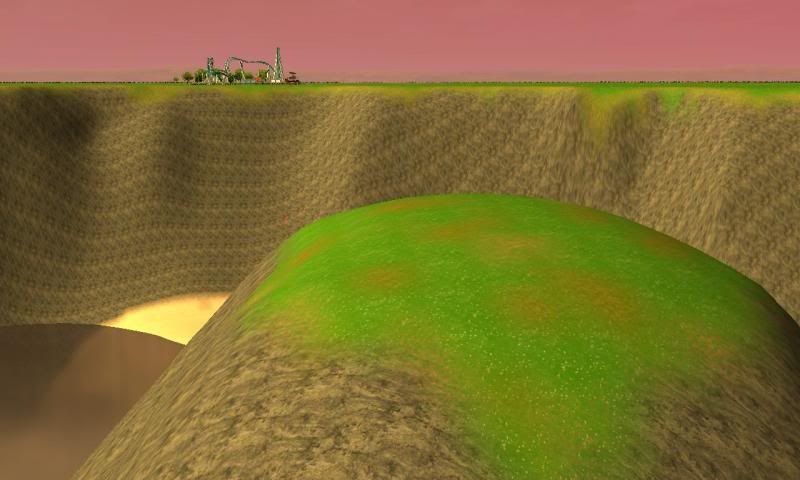
I've tried placing rocks on the cliff face, but it really doesn't look good at all.
I've angulated the faces.
I tried adding greenery on level parts of the main cliff face but it looked weird. Besides, the hypothetical sea waves and rain would erode away the cliff face so nothing could grow there.
However on the rock there is some green.

I turned up the graphical settings to improve the appearance so that might help. Including bloom. The sandbank is now an eye cauterizing strip of agony.

Feels like a case of trial and error. Achieving a little and just going away from it. I've been getting distracted by gardening which won't help things at all.

Maybe if I plant some grass along the edge of the primary cliffs it might make the appearance be nicer?
 
Re: Scw55's Thread. Bits & Pieces (16/05/14)

I've been doing work. The Cliff Textures look better and its geometry is more credible.

I keep pendulum thinking when riding the B&M Flier "it's too short!" "No it's fine how it is! Not all coasters are colossal Adrenalin machines!". I'm probably near to being happy with how it is.
I've done some things in the mean time as my subconscious works on it such as a few gardens and a Strange Coaster.

here's a PoV of "Puffin" the S&S Free Fly Coaster. My first "official" layout of this coaster's type. I've been trying to use it in the past and I have been dissatisfied with it. I think why it works better this time is that I start off with a traditional approach to track layout and then I slowly crank up the gimicky track affects.

The intent for this coaster is to provide a "family" option for a coaster. Syth (and the WIP Guillemot) are for the Thrill Seekers. Guillemot despite being a flier is more Manta and less Crystal Wings. Perhaps beyond Manta. So yes, Puffin exists for a lower intensity Coaster option, but it still has its own unique draw. Like how RITA, Air and Thirteen (and maybe to some Smiler) in Alton Towers are family/less intense options than Oblivion and Nemesis. But they themselves have their own strengths.

Unlike my previous parks, I have been aware of keeping a good ratio of flats to tracks. This theme park won't turn into Spaghetti Junction. I think it might negatively affect the terrain I've conjured. Too much development would do this too, so I am making sure I don't go overboard. The "gardens" I'm building will help reduce the conceretelandness of the park.

Here's the Puffin PoV:

[youtube]http://www.youtube.com/watch?v=y8pLGZaYUjA[/youtube]

I've enabled Bloom to help things look better (and to make faults with cliff textures less noticeable). But it has affected the FPS when I am recording with Fraps. So for future recordings I will disable it, because I don't think the compromise was worth it.
Because it hasn't affected this ride too much, I don't think I will do a re-recording.

And I forgot screenshots. Gargh. Next time I boot up RCT3 I'll do them.
 
Re: Scw55's Thread. Puffin (28/05/14)

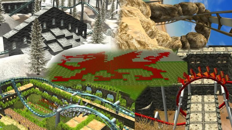
Oh because since acquiring Fraps my PoV videos will be more "regular", I've added "Channel Art" to my Youtube Channel for the sake of prettiness. I'm kinda semi serious on the channel. I know things I will need to do, such as exploring the world of Video editing. But in the mean time I'm happy just using it as a depository for POVs to share on forums.

channelartPSD_zps01a144f5.jpg


I made it in Photoshop ofc from 5 screenshots. I didn't choose from a roster of screenshots. I went from the latest screenshot in my Screenshot folder and worked backwards. Choosing which images I wanted to include. If I had actually planned this image, I would have it looking more regular and neat. The quadrants would line up. But then again, I personally like its roughness. I'm a Fine Artist (even though I'm studying to be a plumber) when I am not playing RCT3, so the roughness is more "me".

I kinda now want to do an image where I edit screenshots of different track together so it looks like it's one piece (even if it changes colour). I think that affect would look awesome.

(Notice all 4 coasters are B&M? :p Guess who my favourite manufacturer are design-wise)
 
Re: Scw55's Thread. Guillemot has landed! (31/05/14)

It is time for the official reveal of... Guillemot!

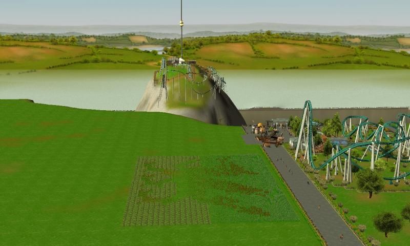
Situated on an off-shore rock, this coaster weaves itself around the crags. Feel the sensation of flight as you're sent into the open sky. It requires great skill to navigate this stoney hazard.

Guillemot is a terrain B&M Flying Coaster that utilises its surroundings for maximum affect. The first half of the coaster is a pre-lift hill section. But do not be deceived... a Pretzel Loop lurks here. After the lift hill, the surprises keep coming. The whole rollercoaster has been built so that you have a great view of it regardless of where you stand on the pathways (inspired how with Nemesis, you can look down into the pit as a passerby).

Point of View Video
[youtube]http://www.youtube.com/watch?v=-t6wUtmS9eo[/youtube]

Screenshots

2014-05-31_00012_zpsabf029b1.jpg

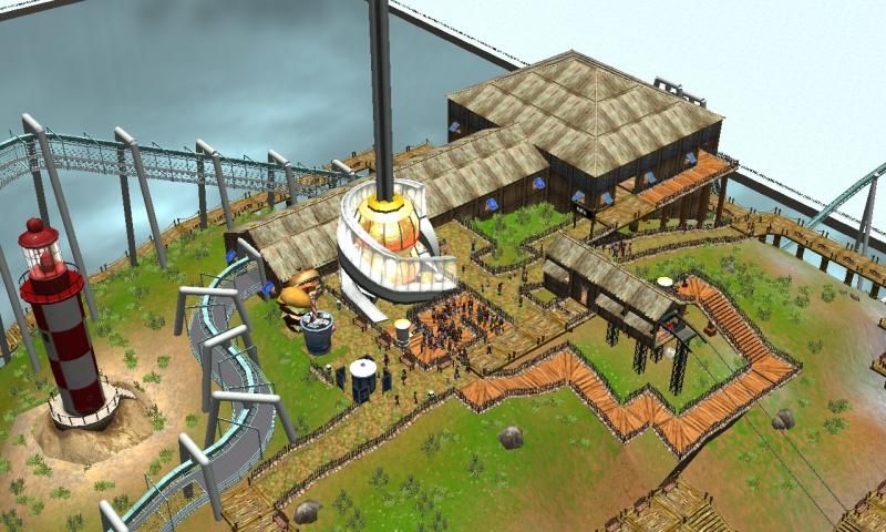
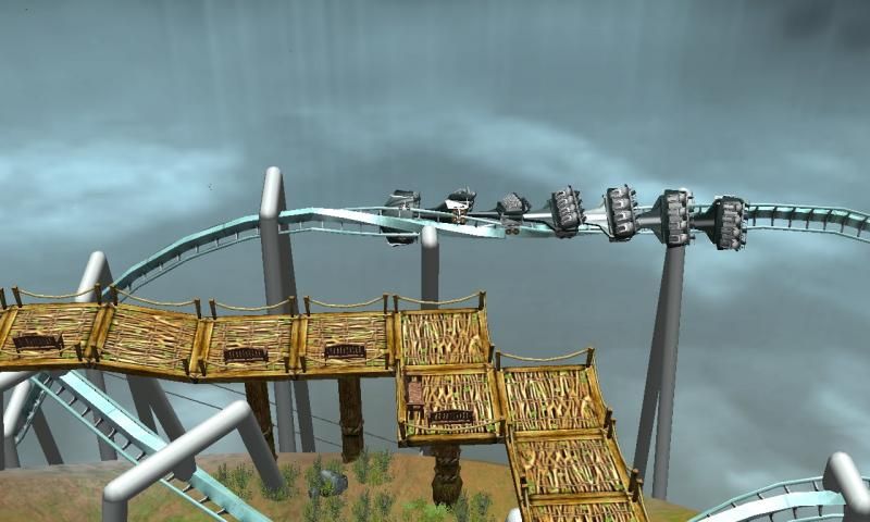
The station and summit.
The station features the default bamboo set because I wanted to minimise the impact of human made structures. The intent of design on the rock was to keep it noticeably more untouched than the mainland. It still has blatantly human structures such as the Light House and the Observation Tower.

2014-05-31_00001_zps95695397.jpg

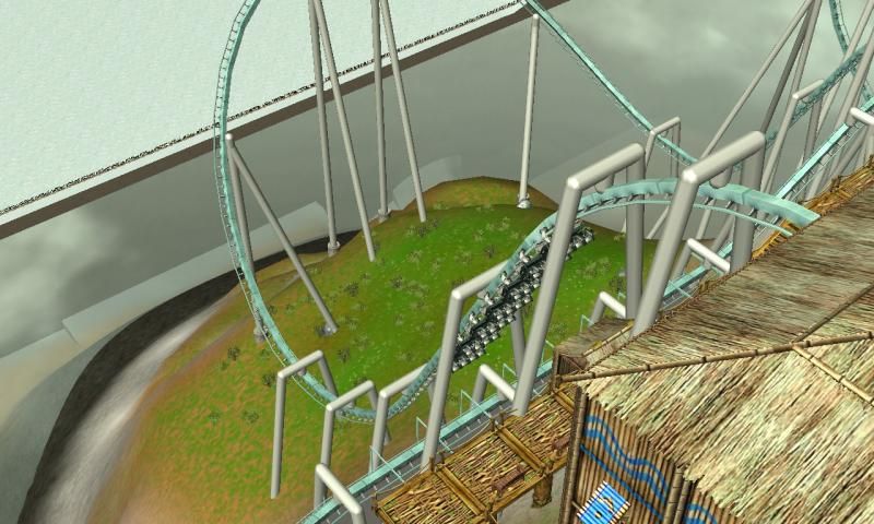
First drop straight out of the station. I think pre-lift hill sections of coasters are great because they get a pace going from the get go. If someone is hesitant about agreeing to ride, they don't have a torturous lift hill to endure. I had difficulty designing the break run which the drop goes over. Originally, it was too close and I wasn't keen. The structure covering the pathway is to protect people from being bombarded by lose objects.

2014-05-31_00002_zpsfa77557e.jpg

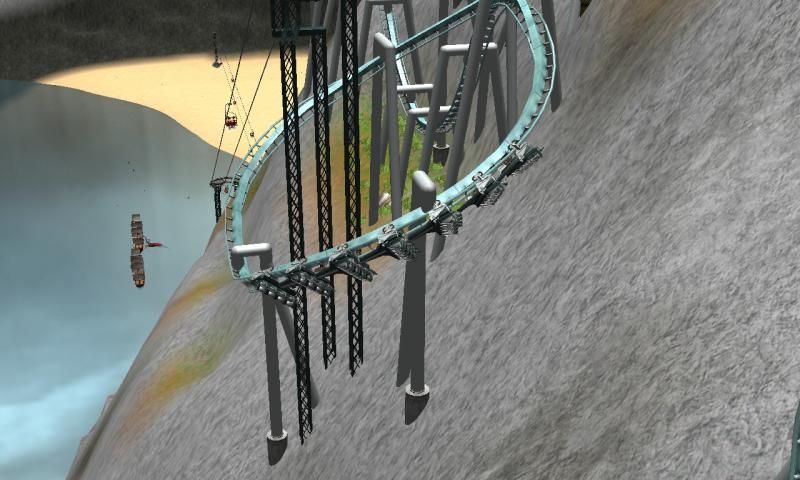
An overbanked turn. I enjoy using this element on suspended coasters after the first drop because I just think it's cool. It exploits the void beneath the rider's feet very well. It works nicely on Wingriders too. The white isn't water, it's snow ground texture. I found water overflowing the park's boundaries would corrupt my game saves. So I enclose all bodies of water. I found out using snow makes the containment less obtrusive.

2014-05-31_00003_zps9a23c57b.jpg

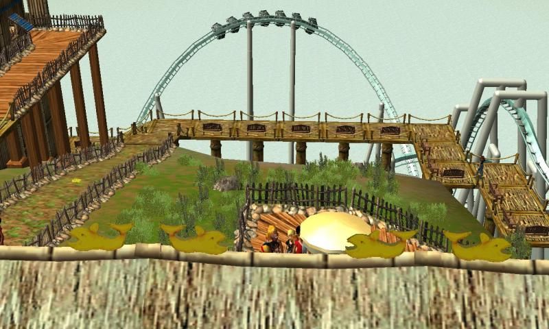
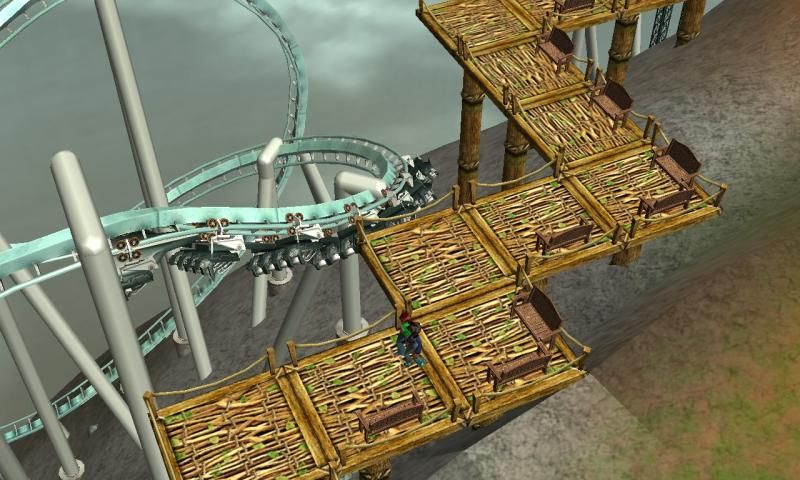
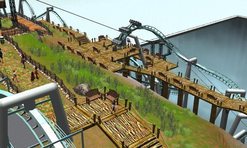
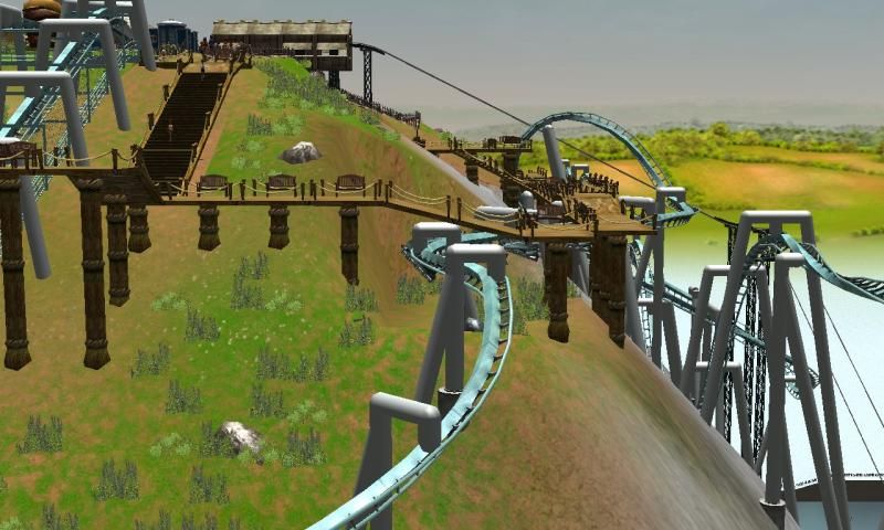
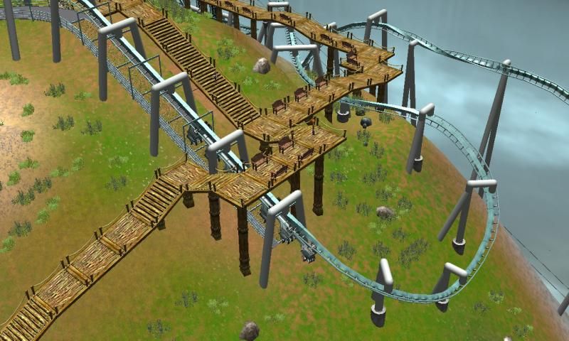
An instance of pathway interaction.

2014-05-31_00004_zps1945695d.jpg

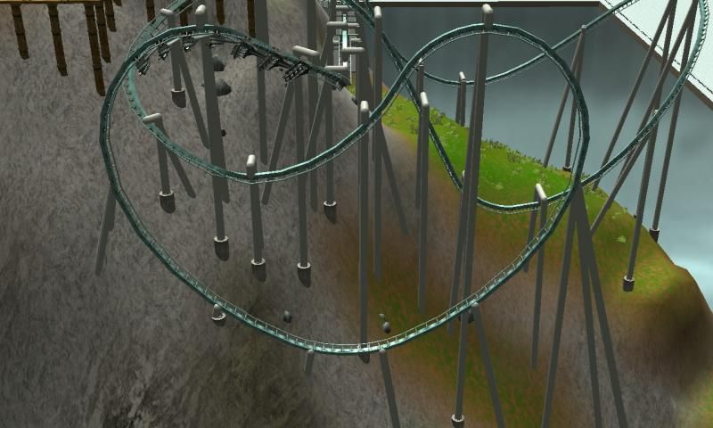
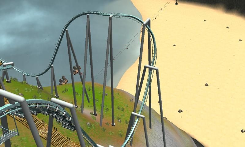
The unexpected Pretzel Loop. That's the great thing about building a coaster on an irregular surface is that you can place large-scale elements at unexpected points on the layout.

2014-05-31_00005_zps11d26c7f.jpg

I like this bit of the layout because it seems very quite. It's in quite a secluded spot on the rock. It ascends the side of a cliff with its station above, and to its right is a walkway. Unintentionally quite but I think it works well. Especially since the rest of the layout is quite, hastey.

2014-05-31_00006_zps1dcf6d24.jpg

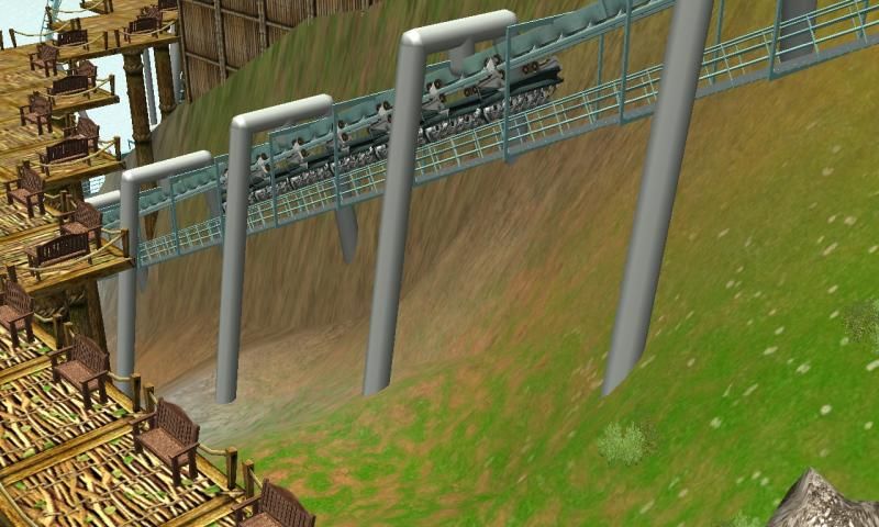
The drop after the lift hill. You get a great view of the sandbank leading up to the cliffs of the mainland.

2014-05-31_00007_zps0bb048d7.jpg

I liked incorporating half an Overbanked Turn with an Inline Twist. It's a shame the CTR wouldn't let me do half a Overbanked Turn when in the "flight" position. Ah well. Nice view from the walkway of that element.

2014-05-31_00008_zpsd1757aaa.jpg

I do love it when it snakes around the Chair Lift pylons. It's great when you ride the Chair Lift and the train snakes round below.

2014-05-31_00009_zps69ced3b9.jpg

That teaser image from another angle. I track elements being integrated with the park's walkways. Oblivion's tunnel observation area is a great example. It lets you interact almost with the ride without actually riding it. By being allowed to be so close to it, you get the chances to experience a sliver of what riding it would be like.

2014-05-31_00010_zps4ec296ff.jpg

Some lovely snaking underneath the walkway.

2014-05-31_00011_zpsc7b7ce76.jpg

The end. This is a lift-hill that takes the train onto the block breaks. Its functionally a break run that pulls the train up.


A lot of these path interactions are incidental. I actually started off by placing the pathways around the rock first. When I was building the layout, I would simply delete any pathway that was in the way. Afterwards I repair the pathway and tweak it so it looked "nice".
 
Re: Scw55's Thread. Guillemot has landed! (31/05/14)

Awesome! Seems to be a true terrain coaster, with a good deal of force, a department where most B&M versions fail to deliver consistently. It is most definitely unique, and somewhat graceful.

My only complaint would pertain to the lift hills. They both seem a little unnecessary, with the first needing a little more momentum loss before ascending. Oh well, I suppose it remains your best coaster yet. :--D
 
Top