FORUMS - COASTERFORCE
You are using an out of date browser. It may not display this or other websites correctly.
You should upgrade or use an alternative browser.
You should upgrade or use an alternative browser.
MARCH 15th- UPDATE!
- Thread starter LiveForTheLaunch
- Start date
LiveForTheLaunch
CF Legend
Kayy, so be fair to these screens because the areas being shown are very incomplete, especially the one with "Plague".
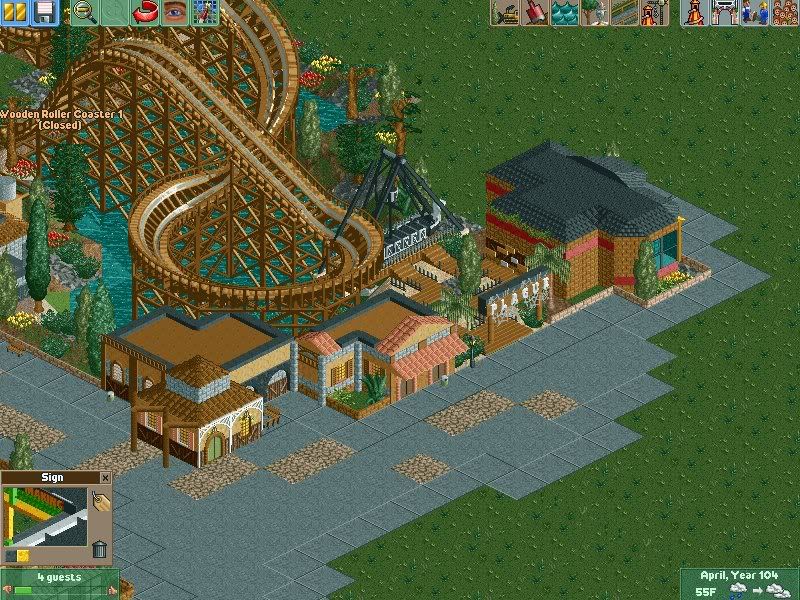
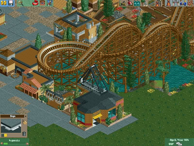
Few new buildings and a pirate ship; I might modify the buildings and make them a bit bigger though.
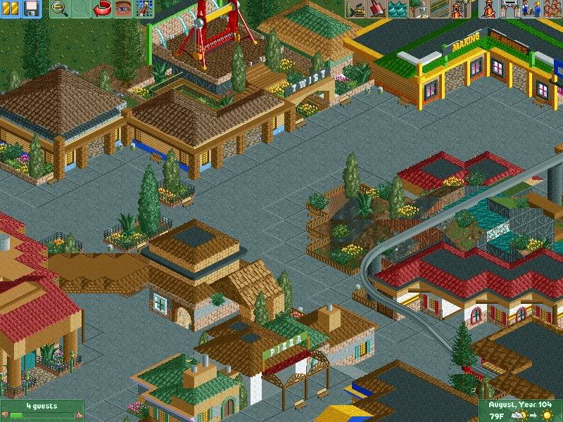
A few more new buildings, and a ride called "Twist", which is in need of a better name, so any help would be appreciated!


Few new buildings and a pirate ship; I might modify the buildings and make them a bit bigger though.

A few more new buildings, and a ride called "Twist", which is in need of a better name, so any help would be appreciated!
OK I haven't been following this park recently so if I comment on something that's already been justified then please excuse me.
In the first and second picture, now I'm not too sure but it certainly looks like the woodie was zero-clearanced to fit Plague in. If not then I thought the Pirate ship swung higher than that, aw well, I guess it has been a while since I last played RCT2. If so then that's a no-no. I'd hate for you to edit that whole area just to move Plague one space away from the woodie because the buildings and stuff there do look really good. I sense much improvement since last time I saw your work, you're much better now than what I ever was. Another thing though is the oddly placed pebble path pieces. Is that supposed to be some way of making it look like it was a bodgey job making the path or that it's eroded over time?
In the last picture, things look pretty good although the monorail track seems to be floating in mid-air. You should support it. With the Top Spin you should colour it similar to the buildings that surround it first. As for the name, I got nothing I'm afraid. I'm not too sure what the relevant theme is in that area of the park.
LiveForTheLaunch
CF Legend
^ AW, it's Claw! And no, I'm not better than you ever were.
As for the Plague, err, I may have zero-clearanced but it's really not as close to the wooden coaster as it looks in the pictures. Well, it is, but it doesn't like, run into it or anything.
About the paths, I got that idea from a park somewhere on NE and thought it looked good so I tried it, because pure concrete didn't seem to fit the theme of the area.
Thanks for the comment!
LiveForTheLaunch
CF Legend
Thanks Pierre!
To be fair, I hate making buildings sometimes too, it just gets so tedious after a while and it's hard to keep thinking of new designs so they don't become repetitive, but merci beaucoup for the compliments.
To be fair, I hate making buildings sometimes too, it just gets so tedious after a while and it's hard to keep thinking of new designs so they don't become repetitive, but merci beaucoup for the compliments.
Screaming Coasters
Strata Poster
ere Taylor, is that stage built for our explicit show?
Erol And Taylor, live and in the buff.
Erol And Taylor, live and in the buff.
LiveForTheLaunch
CF Legend
^ PRECISELY what I was thinking when I constructed it.
Screaming Coasters
Strata Poster
Awesome!
I'll draw up a list of positions and I'll run them by you.
I'll draw up a list of positions and I'll run them by you.
LiveForTheLaunch
CF Legend
^ I have a few new rides, and I started a Kidzville so I'll have to post the pictures soon I suppose!
A
Anonymous
Guest
Pierre said:I never have the patience to build buildings like that, I end up doing a little house 4x4 squares which looks turd and then just make a ridiculous rollercoaster so kudos Taylor!
The station for the coaster looks awesome.
You're not the only one. I'll start my parks with detailed buildings and scenery and then after awhile I'll just throw up some plain brick 2x2 buildings with no character. No patience I guess.
Very nice park though. Every detail in the buildings look great.
divvie_dave
Mega Poster
I never really look in the RCT1/2 topic... but what you have done is something quite incredible.. well done you
LiveForTheLaunch
CF Legend
Here are a few new screens.
The start of Kidzville, not even close to done:
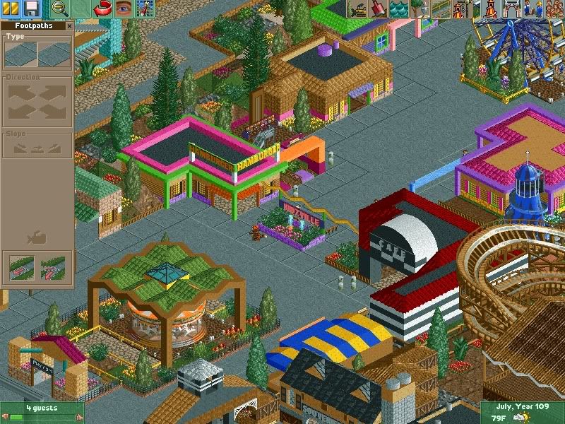
Outlaw (a new themed scrambler)
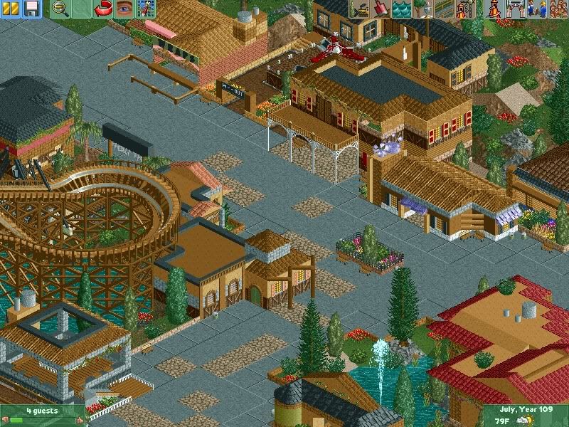
And another random screen
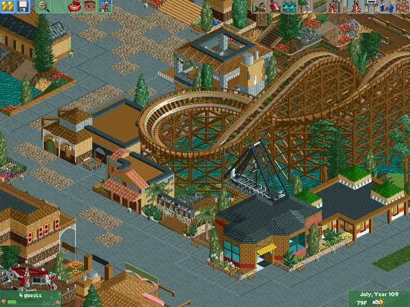
The start of Kidzville, not even close to done:

Outlaw (a new themed scrambler)

And another random screen

LiveForTheLaunch
CF Legend
^ That's all I have built right now, so you're gonna have to wait  .
.
LiveForTheLaunch
CF Legend
^ Orrr, there's nothing to give you a screenie of, because there's actually nothing built beyond the ferris wheel yet  .
.
