What's new

Least attractive B&M

wakey1512

Roller Poster
owenrita121 said:
wakey1512 said:
Shockwave at drayton manor. Technically an intamin i know, but the ride looks rough as
Shockwave looks very nice, with it's setting next to the lake and most of it's elements over path way and the rapids. This topic is about B&M's what look ugly. Plus the fact that it's Intamin anyway.

I last rode it years ago and it looked faded, rusty and horrible. I heard in recent years its had a lick of paint

but to back up my argument for a worn out b&m , dragon khan was starting to look minging, pink track and baby blue nearly white colours. Since the installation of shambalamba its very over shadowed and pathetic too. The recent repaint is ok i guess

still a quality bit of kit, awesome ride
 

Gazza

Giga Poster
I reckon Insane Speed looks pretty vom...A bad colour scheme, which as then just weathered in that climate:
jp0ckd86otgbn4005amv4m.jpg

http://cache.rcdb.com/jp0ckd86otgbn4005amv4m.jpg
 

owentaylor121

Giga Poster
wakey1512 said:
owenrita121 said:
wakey1512 said:
Shockwave at drayton manor. Technically an intamin i know, but the ride looks rough as
Shockwave looks very nice, with it's setting next to the lake and most of it's elements over path way and the rapids. This topic is about B&M's what look ugly. Plus the fact that it's Intamin anyway.

I last rode it years ago and it looked faded, rusty and horrible. I heard in recent years its had a lick of paint

but to back up my argument for a worn out b&m , dragon khan was starting to look minging, pink track and baby blue nearly white colours. Since the installation of shambalamba its very over shadowed and pathetic too. The recent repaint is ok i guess

still a quality bit of kit, awesome ride
Shockwave has had a new paint job and looks much better now, as for saying Khan looks pathetic net to Shambhala is just stupid.
Shambhala has big hills, Khan has big looks, Khan wouldn't ever look pathetic, and with it's new paint job makes it stand out even more than I used to on it own.
 

Smithy

Strata Poster
I sort of get where the guy who mentioned dive machines apart from Oblivion is coming from, the pull outs on them look a bit strange when they're not hidden from view. Krake now they have (I think) that mouth thingy around the drop makes it look a bit nicer.

I don't think I've actually come across any 'ugly' B&M's. Definitely none in this country.

I went through a quick browse on RCDB to come up with an answer but all I really established was that Oblivion is 14 years old, and now I feel very old indeed.
 

Josh73

Giga Poster
Scream at SFMM is in THE worst location. You can still see the parking spot paint jobs under the coaster. Although it's not the coaster itself thats unattractive, but it still contributes to the overall ugliness.
 

Jake

Strata Poster
The Oblivion mirror in Taiwan looks VILE. Oblivion sits quite well on the level ground...

abv1gj000c2lc4a1a4200k.jpg


...but when you SHOVE the same layout on a hill, it looks pretty awful:

7hc4002o4ao8k2kc5lg05h.jpg


The hole looks quite gross too, and it appears there isn't much interaction with any paths around it or anything.

874900061im250l215sm1c.jpg
 

Colossus

Giga Poster
That is vile, the colours, the location, the hole, this topic should be locked now, there surely can`t be any other ride as ugly as that little own a B&M.
 

lazor22

Roller Poster
madhjsp said:
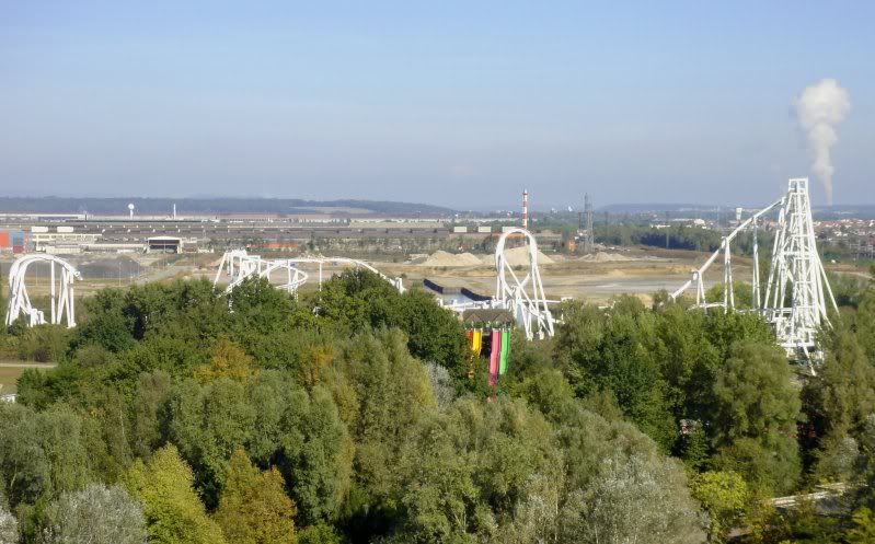
Monster at Walygator Parc has the strangest color scheme. Pale pink, white, navy, and gold? I'm simultaneously reminded of the Michigan Wolverines and infant girls...

c3p825v00097j3mvfl7hoh.jpg

This is definitely the worst color scheme I've seen on any coaster IMO
 

madhjsp

Giga Poster
I don't necessarily dislike the pale pink/white combo, but if that's what you're going with for the track, why use such an odd, non-complementary scheme for the trains? It really does look like they were cannibalized from some other coaster.
 

Martyn B

CF Legend
I can't imagine Walygator has a ton of money, I'm sure they weren't going to repaint the whole thing a new color (did they repaint it at all?).

I'm pretty confident they started repainting the lift hill, either dark blue or black, with yellow supports. They never got very far, and by looking at this picture taken last weekend:

Waly14.jpg


It appears they gave up, and painted over the parts they repainted!
 

Jake

Strata Poster
^ Really? I heard that the managent of Asterix went there a couple of years ago and were like 'OMG, I love your coaster, where did you get it?'
 

Taxi

Mega Poster
Leviathan
-It just doesn't seem right. The lift hill is what kills the beauty, to much beefy track for such little pencil supports. Just seems off. Now I see why B&M never wanted to go with a giga.

Great Bear
-The forest of awkward columns.......need I say more.

All-back Batman Clones
-Yes, I want there. The awkward scaffolding-like supports and the extremely tight layout just looks odd to me. Add some color in there, and you can really make it look nice. They just looks like a mesh of scrap metal at a junk yard :/
 
Top