The ride is amazing in so many aspects.
It's an adventure and the wait is short and atmospheric!
I also rode the old version of the ride, but this one is so much better.
SPOILER ALERT!
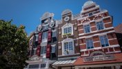
Let's start with the new village plaza. The facades are very well done and each of them looks different. Very colorful and nice use of forced perspective. Even the toilets are very nicely decorated. I also like the signs in the area!

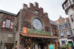
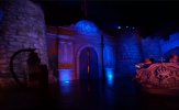
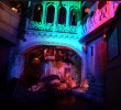
The entrance is so much better than the old one. The new round window looks very nice with its blueish colour.
Another good thing is the birds, who talk to each other in front of the entrance. Visitors who overlooked the ride because the facade is perfectly integrated, are gaining attention by this little feature! We are getting more curious about that to walk into it!

The queue is one of the best I've ever visited. As we are getting up the stairs the music gets more vibrant and we are really in a pirate tavern feeling. This blends up to a kind of discovery/explorer/"ready for adventure? feeling". The parrot is very funny and one of my favorite animatronics in the whole park!
As we are on the upper level we smell a special fragrance, which is emitted on a higher shelf I guess. The main figure Robbemond introduces us to our task and adventure. The Joppie animatronic is lovelily integrated. We are animated to requeue/reride because we don't get the full dialogue very often because the capacity is so good and the queue is moving very fast. Even on very crowded days, we wait 15/20 min maximum!
The soundtrack as we arrive at the station is epic and fits so well to our excitement.
Also here very nice use of forced perspectives. It reminds me a bit of Vliegende Hollander at Efteling.
The boats are very comfortable and the boarding process is very fast and easy. The staff is very good in its role there too!

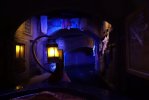
The decent light is very atmospheric and we don't know what to expect after the first curve!
I also like the fact that they work with wind effects there, so the hanging laundry isn't too static!

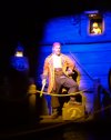
We rediscover the main character and his Joppie. This is nice for kids and therefore it's not too mysterious that smaller children would be scared...
I personally love the Thunder scene! As I'm a big fan of thunders in rides (Taron promotional clips/Tower of Terror Preshow) etc.
The splashdown into the canyon is so epic! I also like that the lantern in front of the boat turns off and on sometimes!

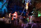
The first scene after the splashdown canyon is also very nicely lighten. I love the screen integration here! The water is in movement and it fits very well into the narration. The animatronic with the crocodile and the hanging Robbemond is very funny as well. The world is suddenly upside down


The detail here is amazing from cheese in the water to the birds, which are projected onto the waterfall dividing the scene from the stilt village.
it also makes sense because of the birdcages later in the village...

One of the best aspects of this ride is the clever use of projection mapping. It looks amazing when the whole hut is lightened up suddenly
and the magic forces are released! The colors look so vibrant on it!
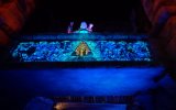
The following is my favorite projection as it fits perfectly to the statue:


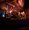
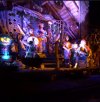
There are so many directions to look at, you cant decide whether to look left or right! Just look at the hut scene above. There are so many things to see and discover and the same thing on the other side!
But there is also a bit to improve IMO. Sometimes the lighting is a bit too bright and unsaturated in color.
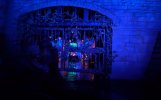
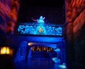
I would go with a deeper orange on this gate for example:

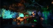
The ship/battle scene is very nice. I like the exotic look of the boat and the dragon in front of it looks very nice!
What I miss a little bit is the use of wind effects here. It would make the scene more vivid and dangerous!

Also here very nice use of smell! It smells like a pirate food stock burning down in the middle of a pirate battle!
It reminds me a bit of smoked sausage and this fits definitely to the coming scene.

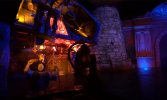
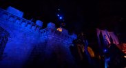
I like this scene but there is also room for improvement. Just look at the stone tower for example. The light could be more immersive there. Maybe a flickering orange under the water to make the battle more vibrant?

We pass by the boat of survivors (rescued figures from the old ride). Sadly the gate is static. It would be a nice effect if the doors were animated simulating water floating through.

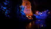
Another improvement could be made: it would have been great to use more wind effects on this whole scene! We are on s higher sea again than before. This would also look better on the hanging sail you see in the right background for example...
To make it perfect they could use cloud/moon projections on the background/ceiling like at Disneyland Paris pirates (boat scene after the jail drop).
Or maybe some more fog that is just above the water?

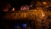
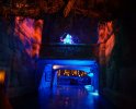
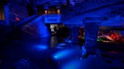
The transition here is very nice as well. I like the style of this door particularly! Maybe a torch would be a nice addition on the left side (picture above).
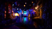
The main scene of Batavia town is one of the most magical scenes I've ever seen in a darkride! Its so dreamy with the hanging lanterns. Its almost like they are floating in the air. So many colors such an exotic smell! The stars do their best at this scene! I also love the giant mythological statue on the left. It brings this exotic vibe to it. Otherwise, it would be too realistic and unexotic I think.

I also loved the playful ornaments on some facades:

This scene reminds me very much of Fata Morgana at Efteling.
The sword battle scene could be better but it's also very good. We are passing by fast and the animatronics are a bit hidden by the plants.
Maybe they could use flickering or rotating light there to make them look more realistic and that there are actually fighting. Also, wind could be used to make it look more realistic so that parts of their clothes would flatter... (key word: Disneyland Paris Skeleton Cave after the burning drop)

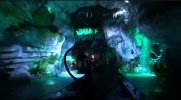
The lighting in the jungle is again fantastic. it differs also from the lighting before in the jungle scenes. So by that, every scene has a totally different feeling and its not too same in every scene if you know what I mean. In the beginning it's bluer than after the drop its more green and bright, then its more colorful and brown/orange, then more red and blue again, then the main town scene which is the color magic overload, then decent green tones along with warm orange, then the blue temple...

The animatronics are nice for kids because they are funny and very original. Here is also a very nice use of projection mapping. It looks so vivid and realistic. Like if magic would be real! We come closer to our goal and are about to find the artifact...
And again the projection mapping fits perfectly to the murals!
the colors are so vibrant and intense!

The temple scene is very nice and the effect is very cool when the magic is released. The whole room changes its face whilst staying original!
At the end, there is again the main character. I rode it also when the projection didn't work there and it was horrible. But when everything works it's brilliant!
The dose of lighting is perfect there!


One thing to criticize would be the underride of the stone gate. It looks very much like industrial concrete not ancient murals. A few cracks/a few roots or some additional painting would be great at this place.

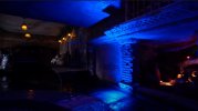
The little lanterns in the restaurant on each table are very nice. They have such a warm light and here and there we also see ancient murals. Just look at the left at the beginning of the last curve. Here and there they could use more water lilies to hide the blue spots a bit. Maybe some more green and orange lighting would be more fitting there. For me it's a bit too blue. It makes it look modern in some way.


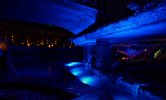
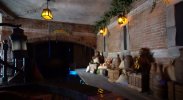
Just before the unload section, there are also small parts, where I think it could be a bit better. Just look in the following picture on the right side for example- some more roots or other theming would be cool there:

Or some more exotic flowers? That's what I miss a little bit in the new restaurant drive thru.
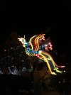
Just look at this magical bird found in ChinaTown Phantasialand during the winter season:

The unload area holds on the perfect quality! So lovely decorated...

This ride is amazing. Its such an experience for old and young. You even get a little bit wet. The story is also easy to follow and is not too present. You can also ride the ride without following it just enjoying the various settings. IMO it's such a high quality like Pirates of the Caribbean at Disneyland Paris (old version), maybe a bit below in my personal ranking. But as seen in the park context you can't really compare it...
It's a perfect addition to this themed area and it fits so well into the new Netherlands area! The capacity is enormous and that's good for the other rides too.
Young children with their families love it because sometimes children can become annoying on higher waiting times.
This language thing does not bother me. I didn't think about it when I was on the ride, so they did it very well to tell the story not only through spoken text!
This is also the reason why I love the queue so much. It's the perfect adventure introduction I think.
For me, this is the best attraction in the park now.
Superb job!


