What's new

The Time Traveller's Playground [WIP - Resurrected 07/08/11]

Aaron

Hyper Poster
So I was inspired by the RCT3 guides on here (thanks random feature thingy!) and I decided to start a MASSIVE project.

It's the beginnings of a new park, and this is the first shot of it, the entrance feature, which on it's own took me nearly 40mins... This is gonna be a LONG project I think...

Anyway, keep an eye on this topic for updates etc. and if you have any comments please let me know!
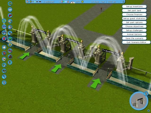
TTPlayground1.jpg
 
Ollie said:
Urmm. The green arrows look nice...

Peep Spawner.


And yeah. Really not much to comment on. All I can really say is add some more space between the edge of the map so you can have a walkway or some ticket booths or something along those lines. I don't really like those fountains or the Blue brick walls around the edge.
 
LOL like I say, it's only at it's very first stage, hopefully with support from everyone it won't turn into one of my many many projects that won't ever be finished lol...

Anyways, I've designed a logo for the park, because I want to put it on billboards at the front and because I can :p

TTPL.jpg


I'll probably push the entrance back a bit now, to add in the billboards, and also refine the entrance area a bit, now that I have a theme to work towards (at first I was building generically)

Thanks for the comments, I can't believe you don't like the fountains though, I think they're awesome!
 
I like the logo. Also with the entrance. Try to make an actual building like real parks rather than have those gates. It makes the whole thing look much nicer and you can do what you want with them then. :)
 
Ollie said:
I like the logo.

Thanks :D

Ollie said:
Also with the entrance. Try to make an actual building like real parks rather than have those gates. It makes the whole thing look much nicer and you can do what you want with them then. :)

Yeah, that's a good idea actually, problem is I want it to be really futurey and techno looking, and I don't have specific stuff for that...

Time to get creative! (*waits for ipod to finish syncing so he can play again*)
 
Logo = gorgeous :lol:

It's nice to see another big project on here. Stick with it though not like me and just get bored after two updates.

Entrance looks nice so far. I'm expecting big things now :)
 
Update Time!

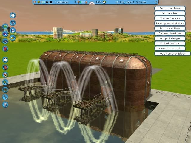
Shot0031.jpg

Here's how the entrance looks now, I've kept the fountains so there!

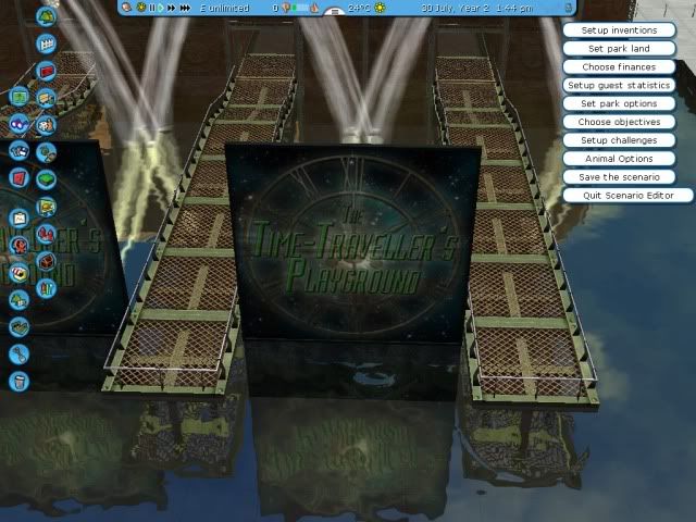
Shot0032.jpg

Here's how the logo looks "in situ"

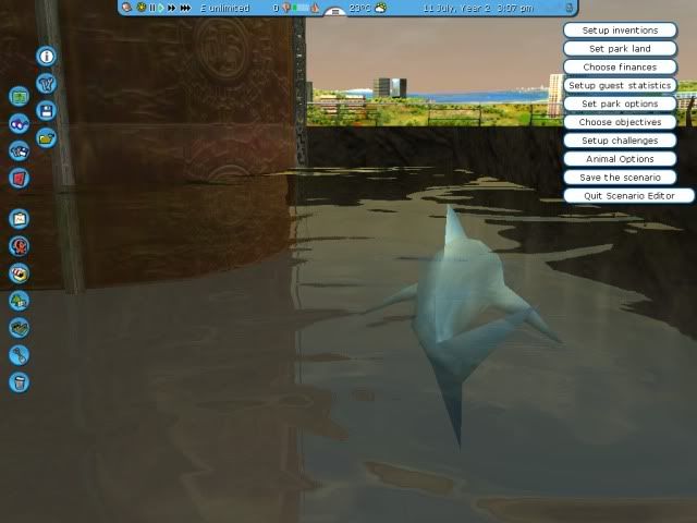
Shot0029.jpg

Because every entrance pond needs sharks... :p (I sealed off the water from the edge of the map, but they're still there... meh)

Shot0033.jpg

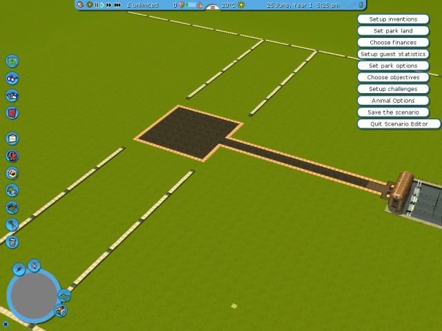
Here's my plan for the brunt of the park, I've measured it so everything is even (yes I'm pedantic) and that central square is where the time machine will go.

So now I've been messing around with ideas, and I'm working on the central section, but so far I am not happy with how the actual time machine looks...

Any ideas are greatly appreciated!

Until next time :lol:
 
Az said:
So I was inspired by the RCT3 guides on here (thanks random feature thingy!)
Not thank you furie for the excellent tutorials? :p

Erm, Two things.

1. The entrance building is too bland and flat. Add some extra shaping too it. Maybe something over the door entrances to make it like a porch or something. Anything to make it less of a simple rectangle shape.

2. Work out you levels now. Get some up and down in place already. Two reasons.
a) It makes the park much more pleasing to the eye. It's very tough to make a flat park look nice.
b) It gives you a challenge to work on. Using multiple land levels can be tough work. Challenge forces creativity. Creativity makes for a much more interesting park.

Oh, and make your future world better than this:
http://www.coasterforce.com/forums/view ... 55&start=0

;)
 
^ see I can't do levels yet because I'm still planning the actual time travelly bit.

Also, I am not amazing at RCT3, so that blocky building was quite an achievement for me, it took me long enough to do that! I'm not saying I don't appreciate your comments, but it's hard for me.

Anyway, there's a bizzare twist coming up soon! :p
 
Az, have a play park to experiment in. I have a single park I use for testing things, trying different things and seeing what they look like.

Doing this, you find out all the funny ways the building engine works (or doesn't as is often the case). You also get a feel for the types of roof top bits per set, and how to mash them together in odd ways - which sets can allow which type of wall, etc. It's all a learning curve

The best of that lot I then use in my real parks. The way to make a none square building is to build the base irregular, but in this case, you could simply put a couple of "awnings" over the entrances to make it look a bit better.

Sorry I never got around to writing an advance building tutorial!
 
The blocky building will work for me, it just needs more surrounding it!

So I will be watching this park, as I am beginning to enjoy the slow growth.
 
Ormerod said:
The blocky building will work for me, it just needs more surrounding it!

So I will be watching this park, as I am beginning to enjoy the slow growth.

YEY Thanks!

I'm probably going to add some lasers at some point too, maybe some fireworks...

I'll have an update soon, I'm currently on a string of lateshifts at work lol.
 
Very good!

I am wondering if each ride will have a differing story or will the whole park run on 1 primary theme?
 
I'm hoping to have a whole story to go for the park, and then individual stories for the different areas, of which there will be four.
 
Update Time!

I scared the heck out of myself tonight, as I installed some new scenery packs to find that the game wouldn't load up the park! (no sivs for sid apparently)

Then I fixed the problem, but found I had accidentally OVERWRITTEN THE SAVE FILE with a BLANK PARK!!! :O

Luckily I found a backup copy and resurrected it, so now work can continue.

Not a major update really, other than I discovered that during some landscaping work, I accidentally lowered more sections than I wanted to and screwed up my building... but I'll fix (and hopefully make nicer) that tomorrow...

Anyways.

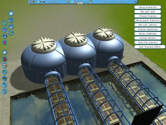
Here's the entrance pods for the park, where people will teleport in (it's the future, kay?)
Shot0035.jpg


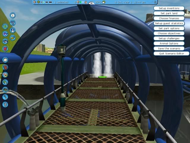
A peeps eye view looking toward the pod
Shot0036.jpg


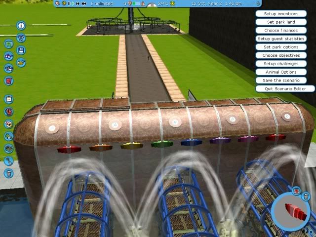
I've added some bells and whistles to the building...

Shot0037.jpg


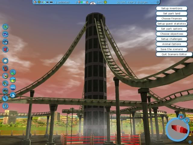
Wait, what was that thing in the background?!

Shot0038.jpg

Hmmmm... Looks strange, perhaps some sort of machine?

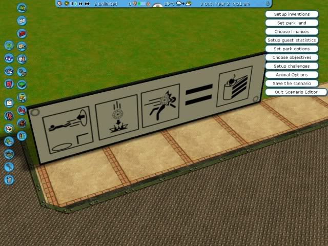
Oh and interestingly, this sign has popped up alongside one of the paths... Instructions perhaps? Or warnings?
Shot0034.jpg


Until Next Time... ;)
 
^Someone's never played portal! :lol:

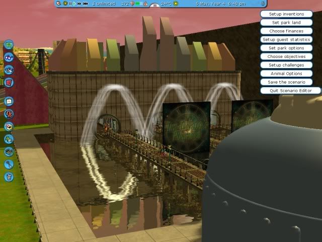
Anyway, a major overhaul of the entrance is in progress, I've decided to go for a retro world's fair type theme, because I can. :p

Anyway, heres the new look entrance
Shot0041.jpg


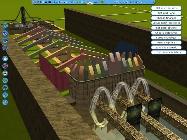
And a wider view
Shot0040.jpg


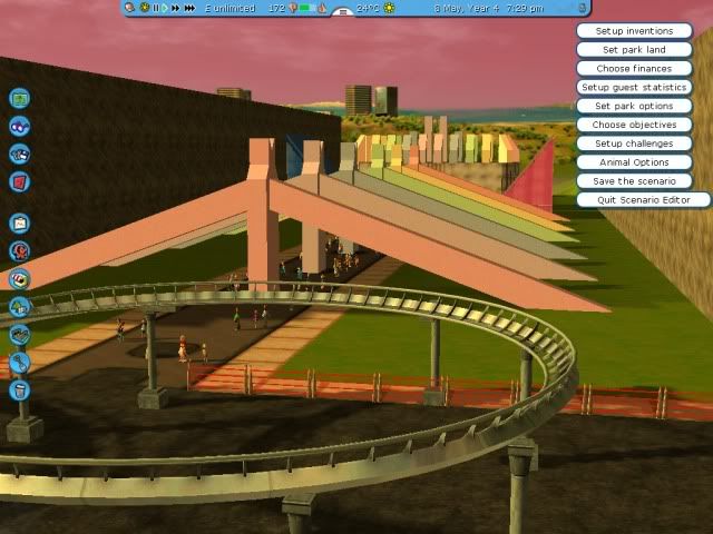
And looking back, with parts of the machine in the foreground.
Shot0042.jpg


Feedback is appreciated!
 
Wow this is looking great!
Cant wait to see the first coaster
A 50s style retro sci-fi area would look good in your park
 
I like it! I am glad your taking time on the entrance, it pays off.

The pod-thing is great in my opinion too, and do I see a B&M looper? :p
 
Top