What's new
FORUMS - COASTERFORCE

This is a sample guest message. Register a free account today to become a member! Once signed in, you'll be able to participate on this site by adding your own topics and posts, as well as connect with other members through your own private inbox!

Revolution paint job - New or Bru?

The best Revolution paint job is...

  • the new grey.

    Votes: 8 44.4%
  • the old orange & blue.

    Votes: 10 55.6%

  • Total voters
    18

Ian

From CoasterForce
Staff member
Administrator
Moderator
Social Media Team
This evening I updated the page for Revolution at Pleasure Beach Blackpool, adding new photos of the grey paint job.

Although the grey looks smart, sharp and clean (and blends in with the northern sky ;)), it looks bland and less exciting than the old orange and blue Irn Bru colour scheme.

Do you prefer the new grey colour or the old Irn Bru colour scheme?

revolutionlogo2.jpg

2greyrev.JPG


revolutionloop4.jpg

8greyrev.JPG


revolutionrach3.jpg

5greyrev.JPG
 
The old paint scheme, but without "Irn Bru" plastered all over it.

If "Irn Bru" has to be included in the old scheme, then I prefer the new colours. Even though the grey is quite dour, the coaster looks a lot newer and fresher.
 
I don't like gray on roller coasters--at all--but I think this one fits nice. Like the gray on The Swarm.
 
Having never seen it in real life & going just by pictures, I prefer the old scheme. It's much brighter & more uniquely identifiable.
 
If you notice the pics Ian posted all of the old color scheme are taken on sunny day's while all the gray paint job pics are on cloudy days. I'm not sure if this was done on purpose but that can actually sway opinions for people who have never seen it in person.

If this was done on purpose I applaud you Ian. If not ignore this entire part.

Having also never seen it I like the old paint job. Bright colors on Steel Coasters are just appealing to me. Not to many other places where bright colors look good.
 
The new paint job looks like those pretentious photos Dave used to take with the teddy bear in colour and the rest in grey and stuff.

A new paint job is a good thing (it was looking a bit old and faded), but the whole thing in that same shade is dreadful. It looks like it's undercoated and ready for the main paint job. Or that the Navy had a few hundred gallons of paint left over and a guy in the pub could get them to Amanda for a decent price - no questions asked.

In terms of the park, Blackpool is tasteless and vibrantly vomit inducing so this blends in like an accountant at Mardi Gras.
 
Seeing it in person against the backdrop of space invaders building changed my perspective on it. It looks much nicer grey, much better than what they done to Rollercoaster/Streaks colour scheme.
 
Youngster Joey said:
If you notice the pics Ian posted all of the old color scheme are taken on sunny day's while all the gray paint job pics are on cloudy days. I'm not sure if this was done on purpose but that can actually sway opinions for people who have never seen it in person.

If this was done on purpose I applaud you Ian. If not ignore this entire part.

Having also never seen it I like the old paint job. Bright colors on Steel Coasters are just appealing to me. Not to many other places where bright colors look good.

Aye Ian visited every day for the past two months waiting for the right cloud cover to ensure he could skew the results of such a poll in his favour. :P

Prefer it how it was, it stood out and was distinguishable in pictures which also showed Big Dipper and Avalanche; now it'll just sort of blend in with them, it almost looks like they've painted it in primer and they're waiting to put on it's actual paint. Which is basically just repeating what was said above but I've only just read that and now I've written it out I cba to get rid of it. So there.
 
I don't particularly like it. I am all for a bit of a spruce up and going for contemporary styling but while I love the new logo, the paint scheme just looks like filthy white.

Although, I will say, judging by those photos it now contrasts with the orange of the Rollercoaster paint job. If they had left Irn Bru orange people would probably be critiscing them for everything being orange.
 
Youngster Joey - hahah! I thought the same when I posted them. I live 5 hours away from Blackpool so it's not somewhere I visit frequently. If somebody can find photos similar to the ones above with blue sky, I'm happy to change them in the interest of "fairness".

I think both scheme have plus points, but the Irn Bru colours win the day for me. I see what Mark means about the whole orange thing though; people (mainly mongs) might associate it with Nickelodeon Land!
 
To me Blackpool's always been about being tacky, colourful and garish. I think that probably makes my answer pretty obvious. ;)

It needed a repaint (and the removal of the Irn-Bru sign - hated that), but not to grey. Having said that, it didn't necessarily have to be orange and blue, just something you'd need sunglasses for... ;)
 
I think the old colours did a good job of making a rather old and dated ride look fab, whereas the new colours just make it blend in with its drab surroundings (for the record, I LOVE Revolution, but it is pretty crap as far as 'modern' rides go).

The sponsorship was tacky though, so I kind of agree with Gavin. Still think I prefer the old paint job though, even with the sponsorship, cus the grey is just vile.
 
I agree with people who have said that Blackpool is associated with delightful tackiness and such, which is why I am going with the old paint job. I love Blackpool's general grossness and lack of a proper theme, but this just looks so dull now! I actually thought the second photo was a black and white photo at first.
 
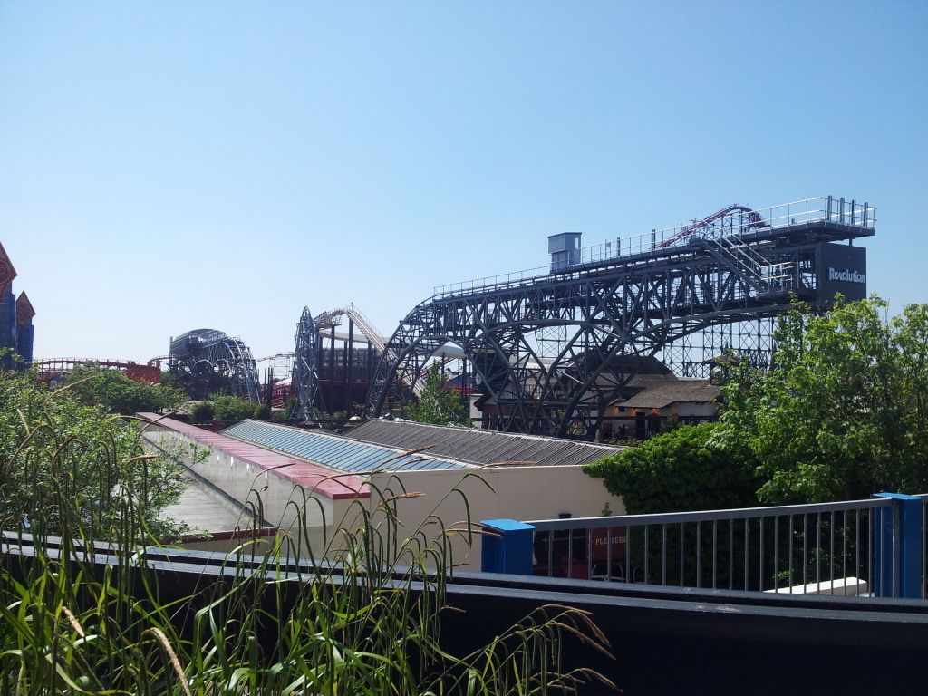
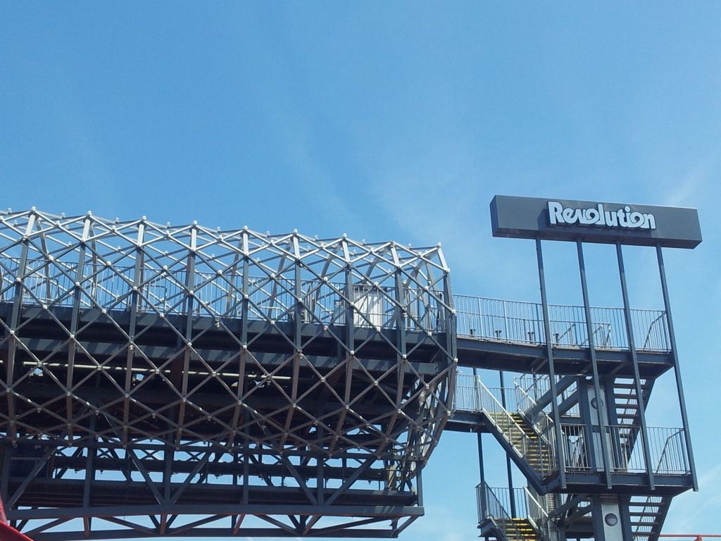
For those that wanted a sunny day photo. :)

CF5.jpg


CF8.jpg


When I first saw it I quite liked it the old colour scheme was a bit too Luton Town for my liking.
But looking at it again I think I prefer the old scheme, it screamed Pleasure Beach, whereas the new scheme is a little too meh.
I agree it needed tidying up, but I think it could have been done better, maybe returning back to the red and white would have been nice?
Two things of note though, it does feet "right" up there when your queuing in the freezing cold, the greyness just adds to the misery real nice ;)
The logo is quite cool, but still, Bru.
 
Hmm, seeing the blue sky & grey photos that Colossus posted, I think the grey looks better with a grey sky. It looks imposing and industrial. In the sunshine, it looks dull.
 
Back
Top