Crazycoaster
Giga Poster
They look much more open than the B&M ones, helped by the 2 across seating I suppose.


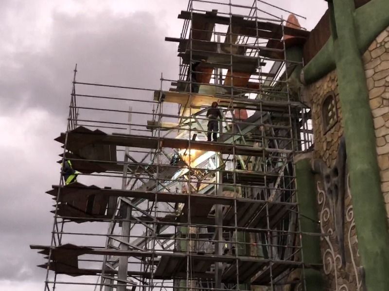
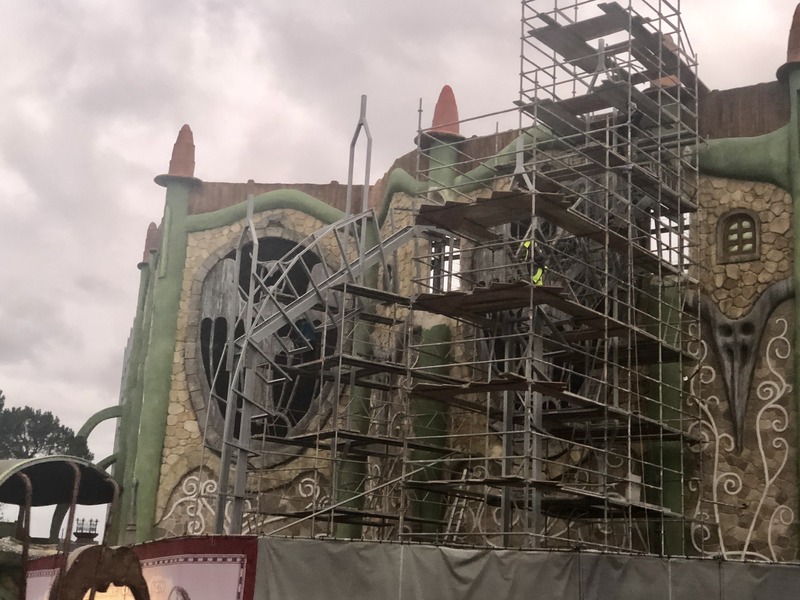
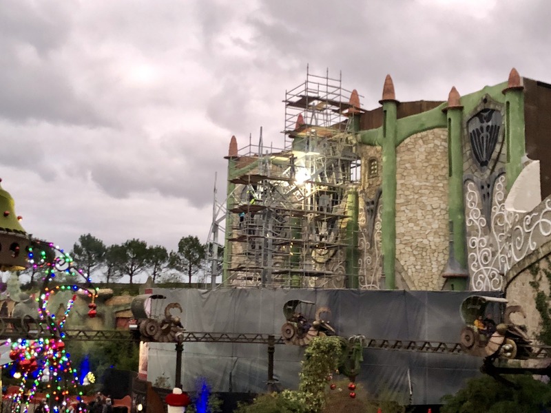


Not massively but some small things have changed, I also haven't seen anybody post it so I thought I would post it myself.That isnt something new? Or am I missing something
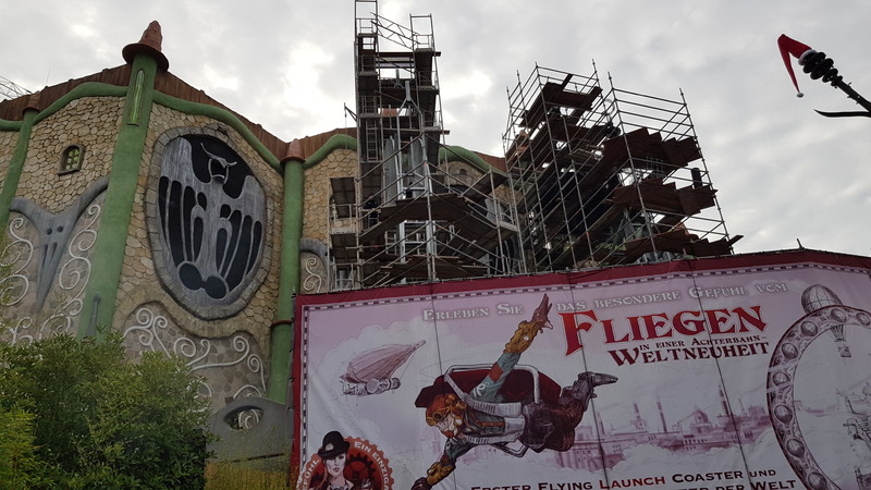
Yep that's all. They've got garlands with white lights and white ribbons along the railings of the balcony inside for Wintertraum. The only other changes have been the blue lamp added two months back as reported on here then and the tape markings from Monday.I might be missing something, but the only difference I can see is the Christmas decorations that have been added for Wintertraum? As a side note, I’m still not massively keen on how the Rookburgh archway is so much shorter than the Berlin buildings on either side. It just looks as though there is a big gap there where something else is meant to go.
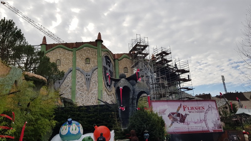


The above meme was shared by a French enthusiast fb page and Phantasialand themselves responded with this amusing image of their own, feat. Kroka one of their dragon mascots:Might be time to retire this old meme then...


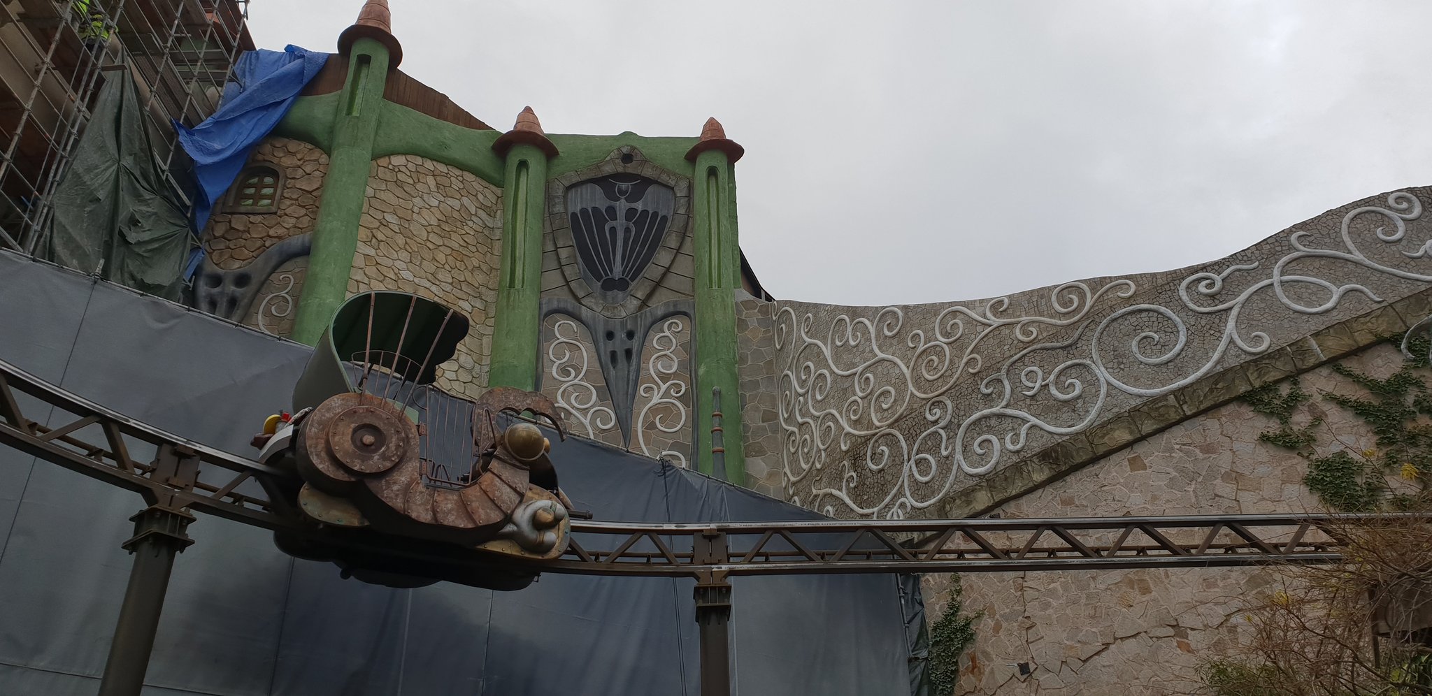
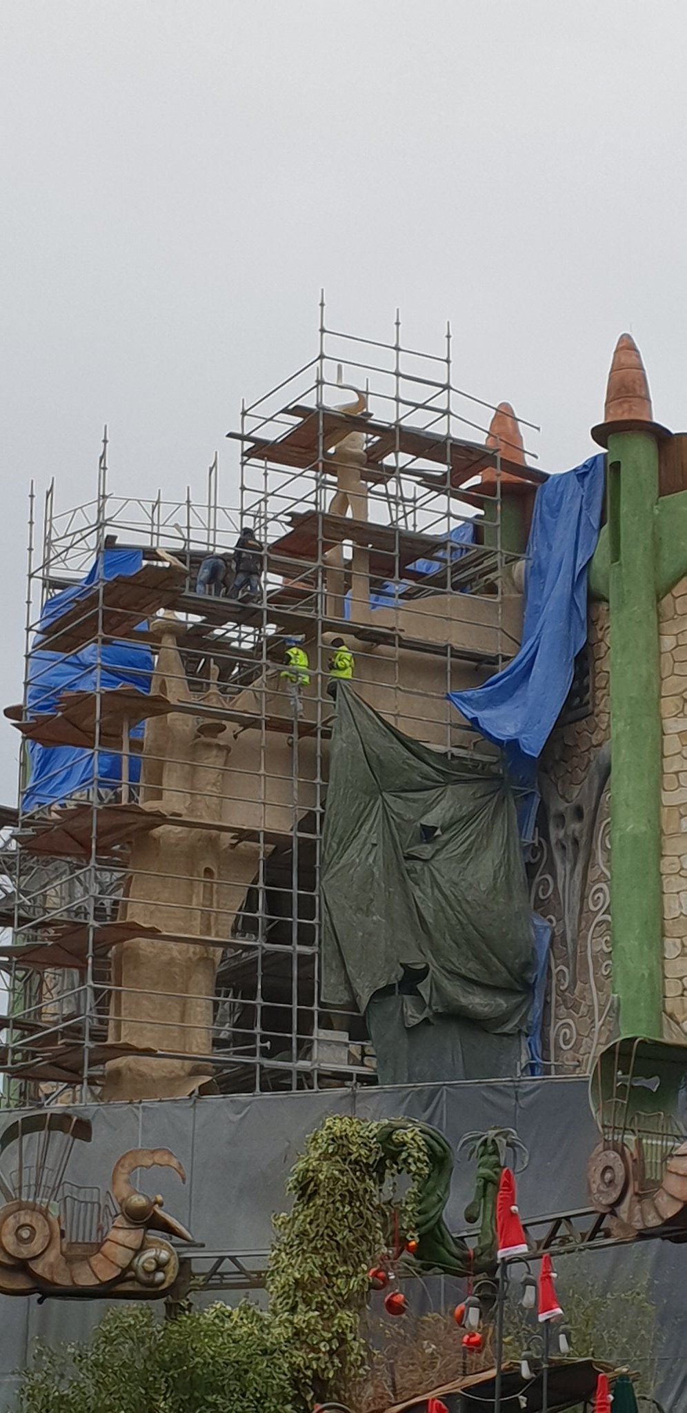
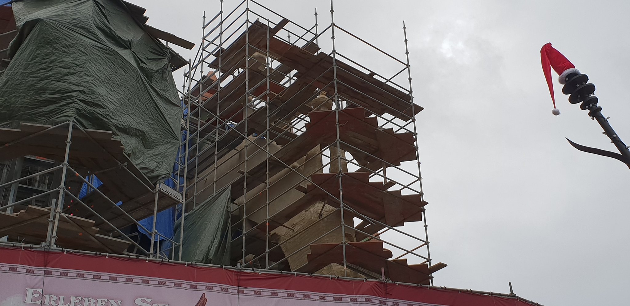
Train’s always need a zero car of sorts, because they’re trailered. Either that, or the first and second (or last and 2nd to last) carriage needs to be rigid. The easiest way to see this is by looking at a B&M floorless or Invert, the first row acts as the zero car - it’s completely attached to the second row, with only the rotation being separate.I don’t see the point in the ride actually having a ‘zero car’ at all? Surely the trains designed well enough that it doesn’t actually need that extra bogey at the front?
