What's new

Paramounts Great Lakes, Some Unfortunate News!

Both Hurlers at Carowinds and KD are light blue trains. You can see the station here, which is pretty much a box. It's sort of themed to a soundstage... although it leaves me a bit confused as that really doesn't have much to do with 'Hurler'.
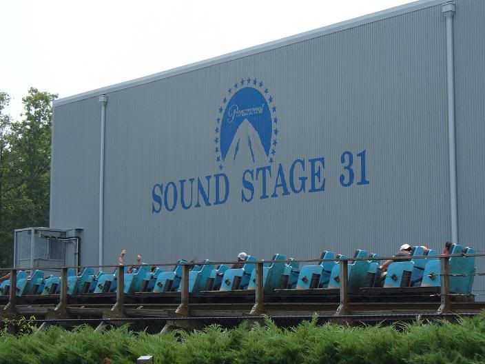
hurler.jpg

Fences black or just a neutral color like gray and the coaster is all brown.
Here's another shot of Hurler in the background (sorry for the bad quality, it was real hazy last week).
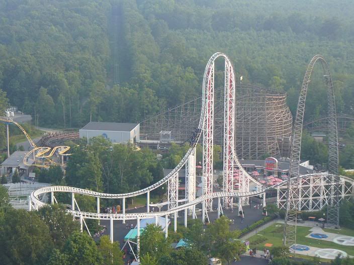
hurler2.jpg


Anyway, good luck... let me know if you need any Paramount pictures or anything as I have something like 250 from my KD trip last week.
 
CP6, thanks that area is really unfinished but only fences, benchs and plants to add. And thanks for the pictures.

Swat, thanks the Action area is very white and grey, I have a colour problem, lol.

-Lofty- thanks.

UncleArly, thanks and here's the link:
http://www.geocities.com/jmanderson_200 ... ainers.htm

Thanks for the comments.
 
NEW UPDATE!

There all mainly unfinished, sorry.

I've been mainly building shops and a few rides.

scr13ck8.png

New resturant near Flyway.

scr11ml9.png

New Huss giant frisbee, Delirium and some new shops.

scr9wr4.png

Part over of Action Zone.

src1qf6.jpg

And another shot.

Comments and whatever welcome, as usual.

Oly
 
It looks pretty good, bearing in mind that you said it's unfinished. I like Delirium, especially since it's a custom, although it would be nice if you can add some scenery to the top as the motor housing. Also, I hope you'll be sinking the entrances? That would be good.
Also, I'm sure you'll add them, but don't forget the tables inside the benches.
My biggest comment, I think, would be treeing. What stood out to me at Kings Island and Kings Dominion is that they were both really nicely wooded. So make sure, especially on that first screen, that you get a good tree coverage near the and that you don't have too much open space.
 
it's looking really good, apart from the deleruim, you can't see much of the ride due th the fact that you've used coster tracks for supports, is there not anything else you could have used?

Anyway hows progress going on the X-car?
UncleArly
 
Looking good, can't wait for it to be finished. You might want to have a look at the building in the second screen in the lower-left hand corner. It's got a few paper thin walls which you might want to fix.
 
This park is absoloutely amazing! I really have nothing bad to say about it at all except that the Huss Giant Frisbee is a bit weird looking. However, it can stay, it looks decent enough.

Good job with all the buildings and the theming. It's fantastic and this is definitely one of my favourite parks.

Keep it up!
 
I like this, I like this alot. Though it looks kinda all "Toy Townie" It looks incredible. It seems like you've been working awfully hard, and your using different techniques for your building.

Its good too see a different approach to things sometimes. Keep up the great work.
 
After a long time of hard work, I've got an update.:D

The Bat


A food building in the same area of the Bat


Ricochet Building


Some Shops on the Midway


Adventure Express


Another shot


Srceens unfinished.

Comment replys later.

Comments and whatever welcome, as usual.

Oly
 
I'll reply screen by screen :D

1 - This screen is weak IMO. The first thing that attracts me is the landscaping. It doesn't seem to flow right. It doesnt seem to be your style either.

2 - I like it. It's nice and simple. I'm glad you didnt over pack it with detail. However the path could do with something else to break it up a bit.

3 - Like this screen too. It's your style, and fits the park's 'theme'. The light blue though might look better darker. But that's just minor. I really like the foliage though.

4 - Again a nice sceen. Simple, but detailed at the same time. :D

5 - Foliage is spot on, so is the tunnel. It's nice to see someone use a tunnel that isn't going through the landscape. The bamboo poles ruin it for me though. BUt yeah the screens are getting better and better.

6 - Worst screen of the bunch. I know it's the most unfinished but I'm not sure what it is you're trying to pull off. :S

Anyways, nioce update, glad your back. I was thinking earlier today, when will you be back with this project.

Keep going and if you need anything i'm there :lol:

Pineapple
 
The screens aren't bad, and they're definitely better than what I could do, but I can't say that they blow me away either, because something about some of the screens just bothers me but I can't pinpoint exactly what. Some of them look maybe a bit plain while some I just don't like the landscaping.

Keep it up though, it's nice.
 
Thanks for the Comments.

Quick update:

All unfinished, sorry.

Is That My Pattey
scr10rf7.png

By airtimeoly at 2007-11-27

Toilets and Water ride station in Congo area of the park.
50454137go0.png

By airtimeoly at 2007-11-27

Beach Club Cafe and Beach
scr11mw6.png

By airtimeoly at 2007-11-27

Beach Club Cafe, again and time gardens
scr12py7.png

By AirtimeOLY at 2007-11-27

The Beast is coming, can you handle it!
scr9pm2.png

By airtimeoly at 2007-11-27

Comments and whatever, welcome as usual.

P.S How do you get rid/hide ride stations because I can't get the hack/tool ( by JJ over at NE) to work, can someone help me, please.

Thanks Oly
 
All very interesting screens. Like you said, unfinished, but here's what strikes me as needing fixing.

-More flowers along the paths
-A tree screen is a good landscape trick to hide the backs of bathrooms from the queue, which you might want to consider. Doesn't apply to just that, but in general. I think it's the oak tree that's a good one for that.
-Tables on the patio will be nice. I suppose you know how, but if not, just use the invisible path on 1 square and place a bench.
-When you do glass cladding on a building, I think it looks a whole lot better if you do the interior to. Or at least make it looks like you consider what happens on the inside. It adds just that much more depth to your building.
-Good use of the steep lift hack. I wish there was a way to show the lift on the whole thing... maybe play with scenery or ride hacking to overlay something similar on top.

The only way to get ride of the stations (entry and exit can go with SoB trainer) is through JJ's thing, I believe. But it should work as long as you dump that zip file into your Data folder (not ObjData).

Looking good-- you anywhere close to being finished?
 
Looking really good dude, except my only beef with it is the blue building. It seems below your level of skill if you know what I mean. However, the rest does look nice and I'd love to see more of that coaster. Your landscaping and everything else looks great as well.

Keep it up, can't wait to see more!
 
Well I REALLY, REALLY hate to say this but it's dead. I would of liked to finish this but I have no inspiration at all to do so, sorry but at the minute it's not being released because one day I might get round to finishing it, maybe, I don't know.

But here are some overviews, of what I did, a bit more than what I showed you lot:

scr18cu5.png


scr17ll7.png


scr16sz2.png


Thanks for viewing and commenting on my failed park.

(PS if someone wants to finish it, pm me and I might let you have it)

Thanks
 
What the heck lol, people need to learn how to finish parks, especially extremely good ones like this. Disappointed in you dude, haha! This was one of my favourite parks ever posted on CoasterForce though, mostly for its extreme realism and overall awesomeness.

Sad to hear you won't be finishing it.
 
I'd like to look around in-game if you don't mind sending it to me... [cedarpoint6(at)yahoo.com]

Shame you couldn't finish it, but I will say this:

Don't give up completely. Let it sit for awhile. You may come back to it. Watkins took me at least a year and a half, I think, and once or twice it sat for quite awhile before I added stuff to it. Same with my Blizzard design. That went at least 6 months not being worked on. Let it go for a little while and see if you come back to it.
If not, salvage what you can, add some buildings and black out the rest of the map with black tiles.

You have a cool park here-- best thing I've seen on CF lately-- shame to see it go.
 
Top