You are using an out of date browser. It may not display this or other websites correctly.
You should upgrade or use an alternative browser.
You should upgrade or use an alternative browser.
Docklands [14/01/2007 - 06/10/08] [New Park - 10/03/10]
- Thread starter Sean_Rohan
- Start date
Sean_Rohan
Mega Poster
UncleArly - Cheers dude! I'm quite impressed myself how the towers came out - they are totally different to all my other designs and somewhat an improvement.
LFTL - I know, it does get a bit repetitive but as long as I know you guys are interested then I'll stick with this project.
Thanks always with the kind comments.
Lauz - Thanks a lot. I'm glad you all liked the new towers, hopefully in the future I'll be able to come out with a few more like The Perl Towers. If I've still got it in me.......
---------------
Wow, 4 months since an update - but I had been concentrating on my West Ferry Project and been taking much needed time off to travel around for a bit. Few ideas here and there.
I've only just picked up the Docklands project, so I'm trying to get the hang of my 'theme' - get things going. Hopefully by the end of the year we'll have a finished project? Maybe I'll have time to start properly on Docklands Phase 2 by the start of next year. (If people, and myself, are still interested!)
So, a few new buildings here and there. Slight change and a few new ideas to kick off within the month.
So, here's what I've got:
A new warehouse conversion - luxury flats at unaffordable prices

Perl Towers surroundings have had a bit of landscaping done to it, still a lot more work to do
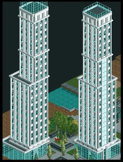
The Strata Tower. Second tallest building in the park - still incomplete

'The Cluster' is growing, two more sky scrapers and we maybe finished here......
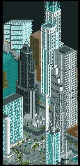
The story so far......
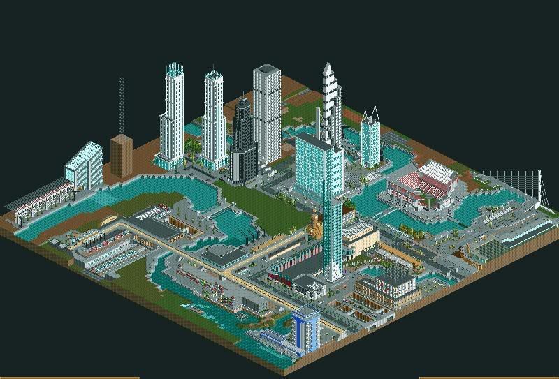
Finally,
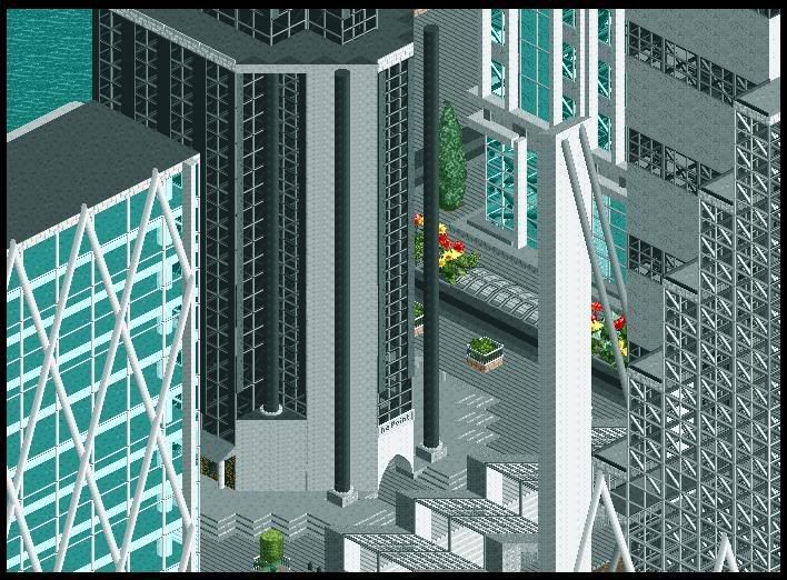
Picture of the day
--------------------
Comments, if any now, are always welcome.
Thanks,
Coaster_Monkey
LFTL - I know, it does get a bit repetitive but as long as I know you guys are interested then I'll stick with this project.
Thanks always with the kind comments.
Lauz - Thanks a lot. I'm glad you all liked the new towers, hopefully in the future I'll be able to come out with a few more like The Perl Towers. If I've still got it in me.......
---------------
Wow, 4 months since an update - but I had been concentrating on my West Ferry Project and been taking much needed time off to travel around for a bit. Few ideas here and there.
I've only just picked up the Docklands project, so I'm trying to get the hang of my 'theme' - get things going. Hopefully by the end of the year we'll have a finished project? Maybe I'll have time to start properly on Docklands Phase 2 by the start of next year. (If people, and myself, are still interested!)
So, a few new buildings here and there. Slight change and a few new ideas to kick off within the month.
So, here's what I've got:
A new warehouse conversion - luxury flats at unaffordable prices

Perl Towers surroundings have had a bit of landscaping done to it, still a lot more work to do

The Strata Tower. Second tallest building in the park - still incomplete

'The Cluster' is growing, two more sky scrapers and we maybe finished here......

The story so far......

Finally,
Picture of the day

--------------------
Comments, if any now, are always welcome.
Thanks,
Coaster_Monkey
Uncle Arly
Strata Poster
WOW!
How on earth do you have the patience to build all them!
It looks bloody amazing.
How on earth do you have the patience to build all them!
It looks bloody amazing.
ciallkennett
Strata Poster
Somebody has too much time to blow....
LiveForTheLaunch
CF Legend
UGH.
I'm SO jealous. The kind comments from me are about to stop, because I'm getting jealous of your architecture, and the more I look at your park, the lamer my architecture looks.
Not even gonna lie, it's freakin' amazing, as usual.
I'm SO jealous. The kind comments from me are about to stop, because I'm getting jealous of your architecture, and the more I look at your park, the lamer my architecture looks.
Not even gonna lie, it's freakin' amazing, as usual.
CedarPoint6
Hyper Poster
Have you ever looked at DarkJanus' En Midvinternattsdrom? He had some great tall buildings in there and I think you might be able to pick up some things to make your buildings look even better.
http://www.nedesigns.com/?ne=tour2&e=11
You have some really great towers coming along. I respect your ability to build tall. I hate that and find that I make a ton of mistakes when I try. They all look very nice, although I do like you could benefit from an accent color or a few more deco details on your facades. It could make a good thing even better.
Oh, and sorry I haven't gotten you those architecture things yet-- I'll try and do that soon!
LiveForTheLaunch
CF Legend
Brian, though that person's buildings are pretty nice, I don't think that style of architecture would fit into Coaster Monkey's park. They look a bit fake, and what he has going on here is extremely realistic.
CedarPoint6
Hyper Poster
Yes, I just mean some of the details. Janus' is more of an apocalyptic future kind of theme, but the buildings have some pretty nice details that might yield some more ideas
Sean_Rohan
Mega Poster
UncleArly - Many thanks! Patience? Yea, quite a bit but now that I've gotten used to building RCT skyscrapers it doesn't take as long as it did.
ciallkennett - Well for someone with a full time job, full time girlfriend, full time personal life and drink ups.....I only give myself 30minutes (every other day) for RCT.
I have no time for children like you, however....
LFTL - I ''lol'ed''. Aw, thanks though......
Your architecture isn't 'lame' at all, you just need a bit more time. I'm quite interested in with the project you've got....so......
Many thanks for the comment, like I've said many times before - the support I've received is amazing and keeps me going.....
CP6 - I have, and to be honest it's been great help for future ideas. As LFTL has said, it's not really my style but I do see where you're coming from. The detail this guy has put into it is quite an achievement, something I still need to work on. Cheers for the help.....
And yea, please send me a PM in your own time. I'm just really interested with what you've got - I was in awe with your model. So, yea, in your own time dude.
Louis! - Dude, hey!
Thanks for the great comment and yes, I do understand the problem with the lack of colours. But you have to think most of todays newer London buildings are either Blue or White glass.....
As much as I would love to try out other colours RCT doesn't really help - with overly bright and a childish selection to chose from (Yes, I know it's just a game folks!!!)
But I am trying to not go over the top with the white.
Many thanks for the comments guys...!!!
------------
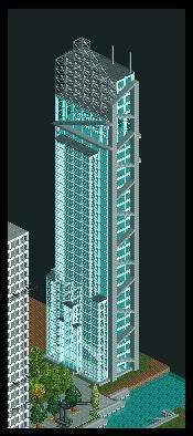
I'll update you guys with a new skyscraper.....
I won't go picture mad, I'll just give you the one.
This project has taken me about 4 days to complete - and is becoming one of my new favorites...
In future updates I'll post more screens of this building.....
I give you 'The Landmark Tower'
-------------
I'm not expecting a flood of replies - but if you have anything to say please feel free to.....
Many thanks,
See you guys soon.....
Coaster_Monkey
[EDIT]
**** it......
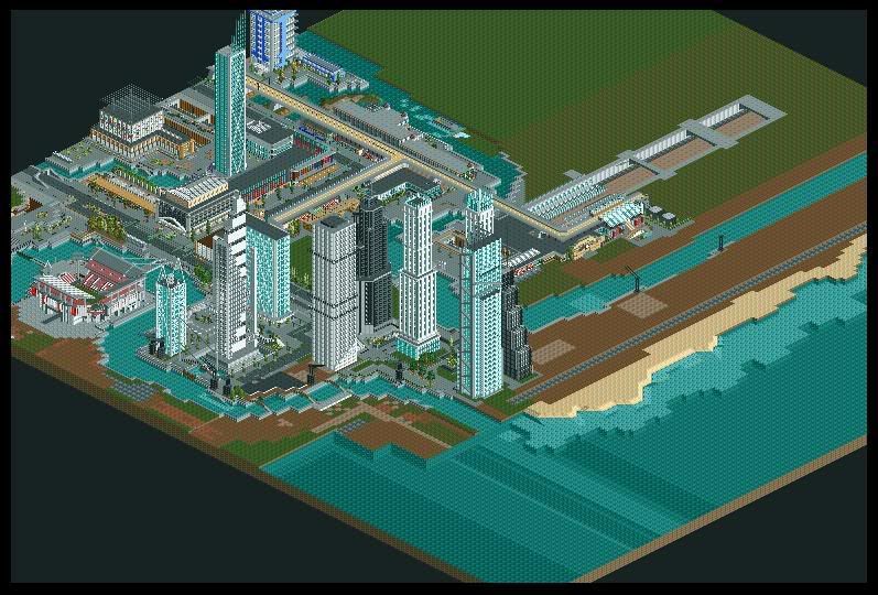
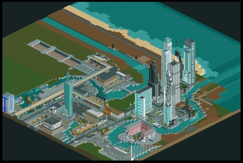
Well, I was hoping to keep this away from you guys for a couple of months - while I get the landscaping sorted, but I thought 'why not'.
Here are the major 'plans' for Docklands V2
-: The Map has expended to 157*157
-: I will be incorporating a beach within this map
-: A casino/hotel strip is being experimented along the beach
-: A huge Dock/Port will be built
-: I now have room for my original plans, an Amusement Park, to be built
This'll be the biggest project I've worked on and this will take a lot of time to complete. I only give myself a few minutes every other day for RCT - so I'm expecting this ALL to be complete by winter '09......
Landscaping i taking place....
Many thanks......
Coaster_Monkey
ciallkennett - Well for someone with a full time job, full time girlfriend, full time personal life and drink ups.....I only give myself 30minutes (every other day) for RCT.
I have no time for children like you, however....
LFTL - I ''lol'ed''. Aw, thanks though......
Your architecture isn't 'lame' at all, you just need a bit more time. I'm quite interested in with the project you've got....so......
Many thanks for the comment, like I've said many times before - the support I've received is amazing and keeps me going.....
CP6 - I have, and to be honest it's been great help for future ideas. As LFTL has said, it's not really my style but I do see where you're coming from. The detail this guy has put into it is quite an achievement, something I still need to work on. Cheers for the help.....
And yea, please send me a PM in your own time. I'm just really interested with what you've got - I was in awe with your model. So, yea, in your own time dude.
Louis! - Dude, hey!
Thanks for the great comment and yes, I do understand the problem with the lack of colours. But you have to think most of todays newer London buildings are either Blue or White glass.....
As much as I would love to try out other colours RCT doesn't really help - with overly bright and a childish selection to chose from (Yes, I know it's just a game folks!!!)
But I am trying to not go over the top with the white.
Many thanks for the comments guys...!!!
------------
I'll update you guys with a new skyscraper.....
I won't go picture mad, I'll just give you the one.
This project has taken me about 4 days to complete - and is becoming one of my new favorites...
In future updates I'll post more screens of this building.....
I give you 'The Landmark Tower'

-------------
I'm not expecting a flood of replies - but if you have anything to say please feel free to.....
Many thanks,
See you guys soon.....
Coaster_Monkey
[EDIT]
**** it......
Well, I was hoping to keep this away from you guys for a couple of months - while I get the landscaping sorted, but I thought 'why not'.
Here are the major 'plans' for Docklands V2
-: The Map has expended to 157*157
-: I will be incorporating a beach within this map
-: A casino/hotel strip is being experimented along the beach
-: A huge Dock/Port will be built
-: I now have room for my original plans, an Amusement Park, to be built
This'll be the biggest project I've worked on and this will take a lot of time to complete. I only give myself a few minutes every other day for RCT - so I'm expecting this ALL to be complete by winter '09......
Landscaping i taking place....


Many thanks......
Coaster_Monkey
Louis!
Mega Poster
This is the one park you can count on me always replying to, purely because of your attitude towards it, you take everything into account, or back up your reason not to. Anyhoo...
Yay! Amusement Park time lol
The only thing I see wrong is that you need the river's mouth to be larger at the moment it looks to narrow. Widen it up a bit to make it look more natural.
That new building is definately the best, especially with the location.
Perhaps in the amusement park section (I take its thats the far corner on the left in that lasr screen and at the top of the first) we could see some more elevation change, fair enough London is pretty flat, but it does have some elevation change.
Sean_Rohan
Mega Poster
Louis - Many thanks dude!
Yes, Amusement Park time - not yet. I've built up a lot of space to fit in an indoor Amusement Fair, space is cleared and the map has been marked out. Just, I won't be starting that until late this year/early next year.
It's not that I can't be bothered or haven't any ideas, it's just I don't see myself playing with RCT as often as I used to......
Bit of a shame really.......
I have widened the river, now looks a lot better, I never realized how narrow it really was.
Just to fill you guys in, the river that runs around my Map is a man made canal (now). It's just while I was creating my beach area, I realized that a river just seems outa place - so I thought I'd give it a back story.
(Short and sweet) Businesses wanted to build. Space wasn't there. Built into the sea. Diverted the water through 'city'. Bobs your Uncle, and your Dad.
[/fin]
I'm glad you also like the new building, I loved it as soon as the idea popped into my head. I'm glad with the out come.
Elevation change? No, not a lot but I'm still landscaping the whole Map.
---------------
New so far (I really can't be bothered to type anymore....)
----------------
(Pictures won't give too much away.....I hope)


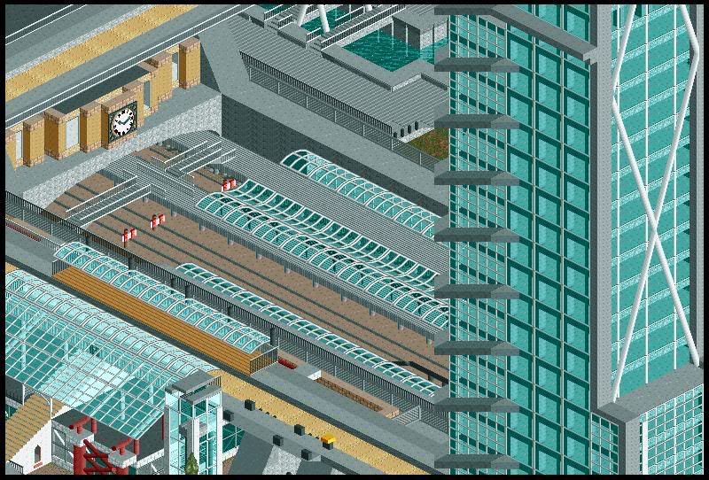


----------------
Until next time CF!
Coaster_Monkey
Yes, Amusement Park time - not yet. I've built up a lot of space to fit in an indoor Amusement Fair, space is cleared and the map has been marked out. Just, I won't be starting that until late this year/early next year.
It's not that I can't be bothered or haven't any ideas, it's just I don't see myself playing with RCT as often as I used to......
Bit of a shame really.......
I have widened the river, now looks a lot better, I never realized how narrow it really was.
Just to fill you guys in, the river that runs around my Map is a man made canal (now). It's just while I was creating my beach area, I realized that a river just seems outa place - so I thought I'd give it a back story.
(Short and sweet) Businesses wanted to build. Space wasn't there. Built into the sea. Diverted the water through 'city'. Bobs your Uncle, and your Dad.
[/fin]
I'm glad you also like the new building, I loved it as soon as the idea popped into my head. I'm glad with the out come.
Elevation change? No, not a lot but I'm still landscaping the whole Map.
---------------
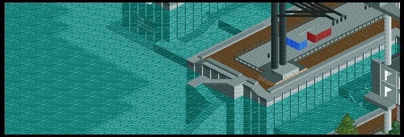
New so far (I really can't be bothered to type anymore....)
The Docks - newly refurbished.
High rise flats are popping up here and there - still a lot of work to be done, however.
One section is finally complete!!
----------------
(Pictures won't give too much away.....I hope)


----------------
Until next time CF!
Coaster_Monkey
Uncle Arly
Strata Poster
Wow, this looks so amazing.
I love how all the buildings whilst all have one main colour, they all look so different, its just amazing.
I especially like the stadium and the train station. So much detail, keep up this excellent work!
I love how all the buildings whilst all have one main colour, they all look so different, its just amazing.
I especially like the stadium and the train station. So much detail, keep up this excellent work!
LiveForTheLaunch
CF Legend
Wow.
That's absolutely all I have to say about that, is wow.
That's absolutely all I have to say about that, is wow.
*Dribble. :shock:
Sean_Rohan
Mega Poster
This is just a quick update - not much time for RCT really, but I still try and squeeze in the spare half hour.......
New Shopping Mall (U/C):
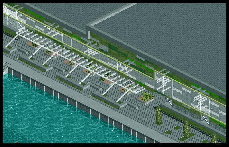
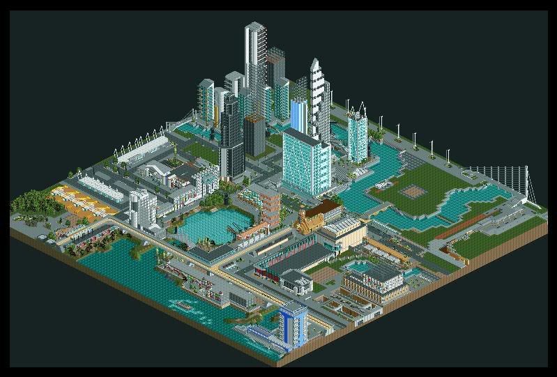
The Way Things Were:
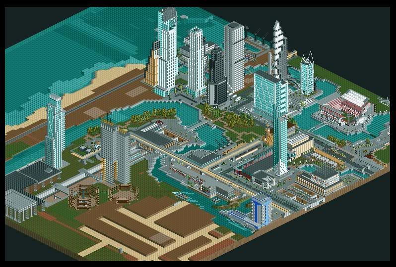
The Way Things Are (Currently):
--------------------
I don't expect many (any) replies - but if you do have something to say, then please......
Many thanks,
Coaster_Monkey
New Shopping Mall (U/C):

The Way Things Were:

The Way Things Are (Currently):

--------------------
I don't expect many (any) replies - but if you do have something to say, then please......
Many thanks,
Coaster_Monkey
Sean_Rohan
Mega Poster
Hixee - Yea, I too can't wait for the final product. When that'll be I haven't a ****ing clue.... 
Another quick update.......
Area is unfinished:
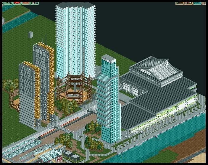
Another view of International Square:
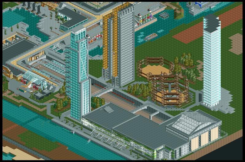
....Just keeping the topic alive.
Thanks,
Coaster_Monkey
Another quick update.......
Area is unfinished:

Another view of International Square:

....Just keeping the topic alive.
Thanks,
Coaster_Monkey
