
You are using an out of date browser. It may not display this or other websites correctly.
You should upgrade or use an alternative browser.
You should upgrade or use an alternative browser.
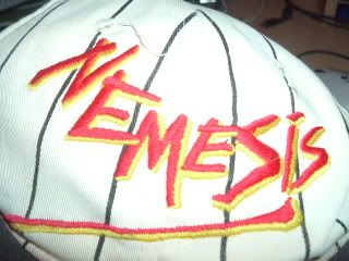
Nemesis Logo
- Thread starter Mushroom
- Start date

The new one looks like its been done on www.flamingtext.com so yeah, the older one.
stevewalsh
Roller Poster
Classic one is just has far more finnesse!
A
Anonymous
Guest
The newer one looks much better and suits the ride more.
The older one looks rushed and I hate how it curves away from the line.
The older one looks rushed and I hate how it curves away from the line.

I prefer the newer for a few reasons. Although both the logos represent something about Nemesis (the older representing the monster itself and the newer representing the tonnes of steel used to hold it down), I think the newer logo is far better-looking and more sophisticated - and more scary.
And as has been said above, it fits in more with the rusty, apocolyptic feel of Forbidden Valley.
Also, I associate most of my experiences of Nemesis with that logo. I remember looking at it at the entrance the first time I ever saw Nemesis and at 12 years old being absolutely terrified. That logo brings back a load of great memories, which I never had with the older one.
So yeah, the 'new' one.
A
Anonymous
Guest
Has to be Classic for me, and just looked and at this moment my vote is the deciding one
kir
Hyper Poster
When I was little the logo was one of the things that terrified me. My brother still has a keyring from 1994, just a plain little plastic keyring with the old Nemesis logo inside it. When I see it I weep, the new logo pales in comparison.
The old logo wins; simple, but very effective. I can't believe they changed it.
The old logo wins; simple, but very effective. I can't believe they changed it.
A
Anonymous
Guest
Old logo for me, was not impressed when they changed it. It was like they were tampering with a part of my favourate ride. Its not like the ride was remarketed at the same time so I don't know why they bothered.